Donnerstag, 12. Juli 2012
How To Design a Simple half-fold Business Brochure in Photoshop
ilovegraphics, 17:57h
This guide will help you design a simple half-fold brochure using Adobe Photoshop. We will be using a few basic tools and styles so it should not be too difficult.
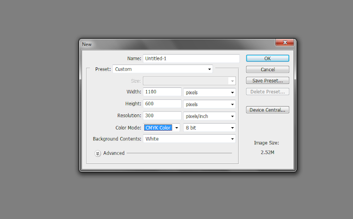
1. Upon opening Adobe Photoshop, create a new document by going to File->New… In the window that opens. You will then be asked to enter the dimensions of your design. This can vary depending on the brochure size you wish to use but for the sake of our tutorial, let us use a standard 1100x600px design canvass. ALSO take note to raise the resolution value to at least 300ppi to ensure a crisp and clear brochure design. Also change the color mode to CMYK if you wish to print your brochure through a commercial printer.
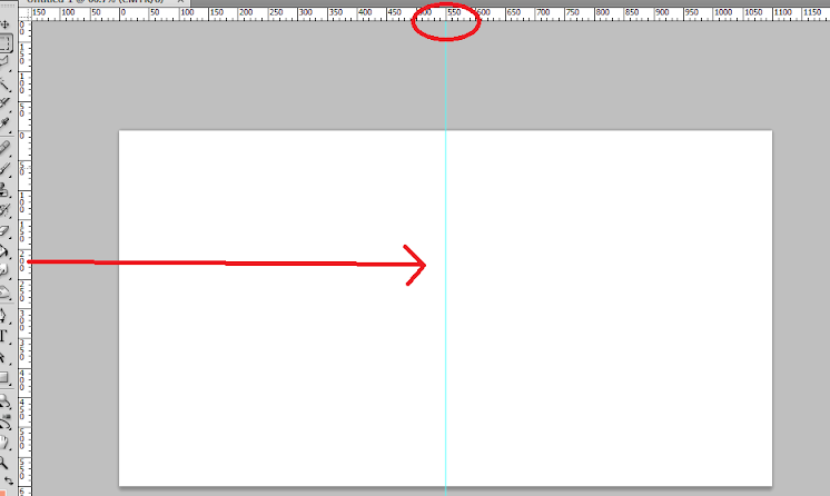
2. With the new document open, bring up the rulers first by pressing CTRL+R. Now, from the left hand side ruler, click and drag a guideline to your canvass. It should be a light blue line. Position it at the center of our document at 550px away from the left or right edge of the document.
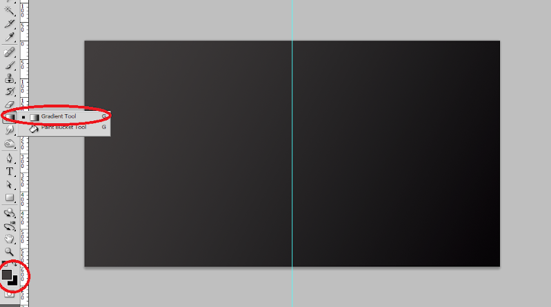
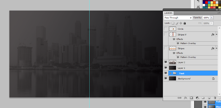
3. Great! Now, the first thing that we will work on in our brochure is its background. While it would be simple enough to use a white background, it is not recommended as it will make the brochure too boring and of course will hamper its performance. The best type of background these days for brochures and many other print designs is a gradient color background. To apply this simply use the gradient color tool in Adobe Photoshop. Simple set two colors as your foreground and background color and then use the gradient tool to apply a seamless color changing background for your layout.
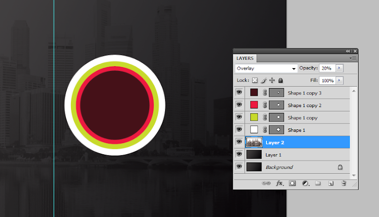
4. The next step is adding a watermark image. Most business brochures and other classic and formal type brochures use watermark images. This is a nice way to populate your background with a texture, without making it too complicated for the design. It is very simple enough to do this. Simply copy and paste the image that you want to use as a watermark on top of our gradient background. Scale it correctly of course by pressing CTRL+T and then increasing/decreasing its size while holding the shift key. If it has color, it is best to de-saturate the image by pressing CTRL+SHIFT+U.
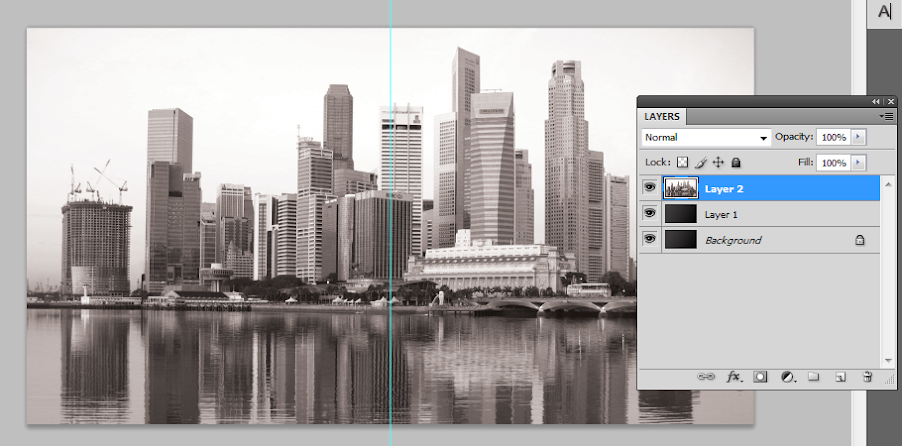
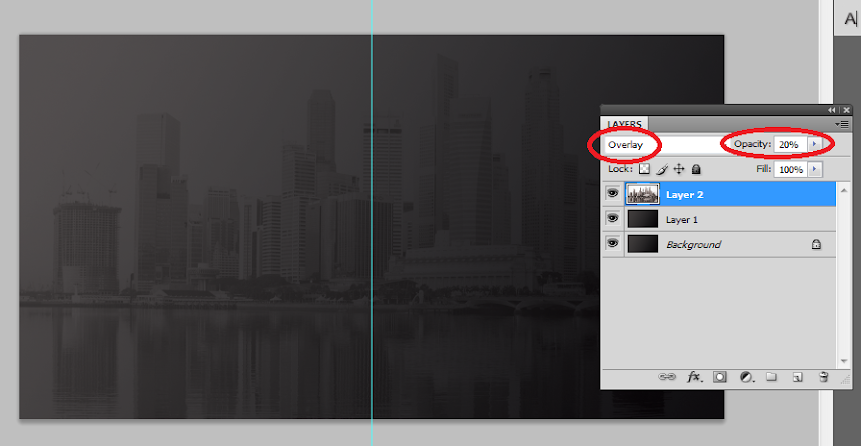
5. To make the image truly a watermark, we change its blend mode. Do this by looking at its layer details in the layer panel and changing its blend mode from Normal to “Overlay”. Then reduce its opacity to 20%. This should make it a true watermark integrated with our gradient color background.
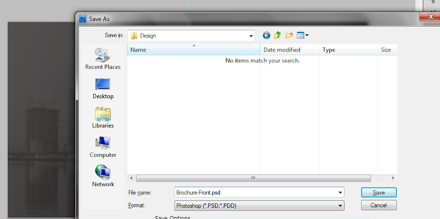
6. Once done, now would be a good time to save your new document. This will be our base template for our brochure design (both front and back). Save it first as a template and the backup. Then, save it again with a name marking it as the front cover design for our brochure.
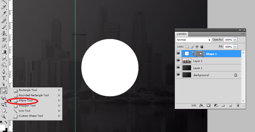
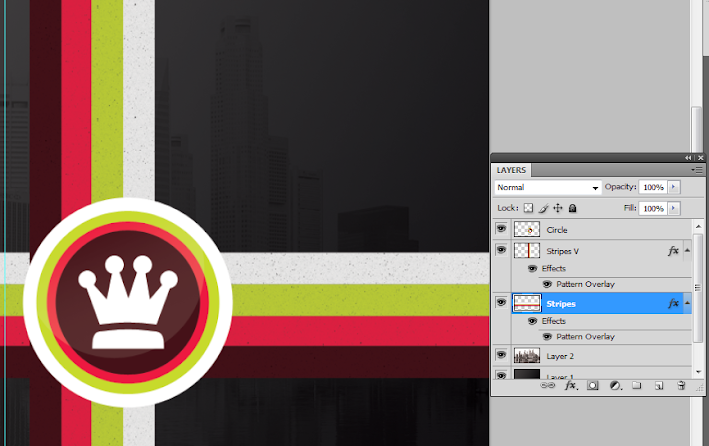
7. Great, now we start designing the front or outer cover of our brochure first. Remember that in printing, the front design of the brochure has the cover of the brochure on the right, and the “back” cover of the brochure on the left. This is considering this design will be folded of course. So we start with the front cover on the right panel. Here we used the elliptical shape tool to create a white circle where we will put the company logo. Hold down the shift key as you inscribe the circle to constrain its proportions.
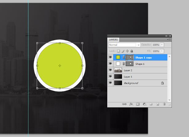
8. We then duplicate this circle by pressing CTRL+J. We change its color to a theme color and then reduce its size a bit by pressing CTRL+T and then just adjusting the dimensions via the anchor points. To make things easier on you, hold down the SHIFT key and the ALT key as you do the resizing and you will see that the new shape will be centered as well as constrained with its dimensions in the process.
9. Repeat the process 2 more times to get a nice modern looking shape set. In this example we used different theme colors to get this nice effect.
10. To create a nice glow effect, create a new white circle on top of our other circles. Then rasterize this layer by right clicking on the shape layer and selecting the option to “rasterize”. Using a large and soft eraser brush, we erase the top part of the circle.
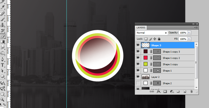
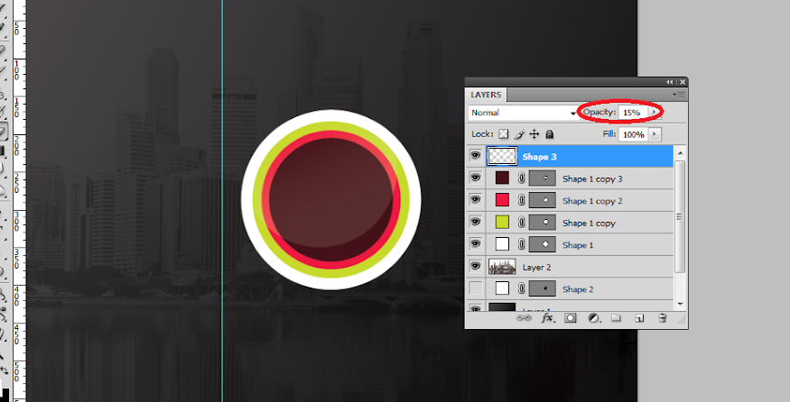
11. Then reduce the opacity of this layer to add that glossy sheen look. Here we reduced it to around 15%.
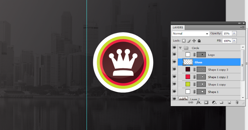
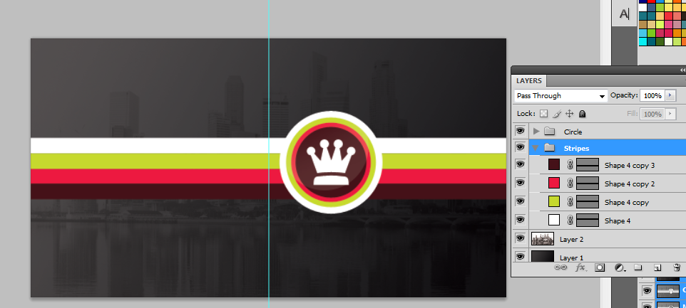
12. Then, we paste in the company logo for the brochure within the circle. In this kind of design, it is best to use a white color for the logo in silhouette form. For our example, we just use some of the custom shapes in Photoshop through the custom shape tool, but for your design of course, it should be your main logo or your main feature image for the brochure. We grouped all of these into their own layer group named “circle”. You can create layer groups by clicking on the “new layer group” icon on the bottom of the layers panel and then dragging all the layers that you want in that group folder.
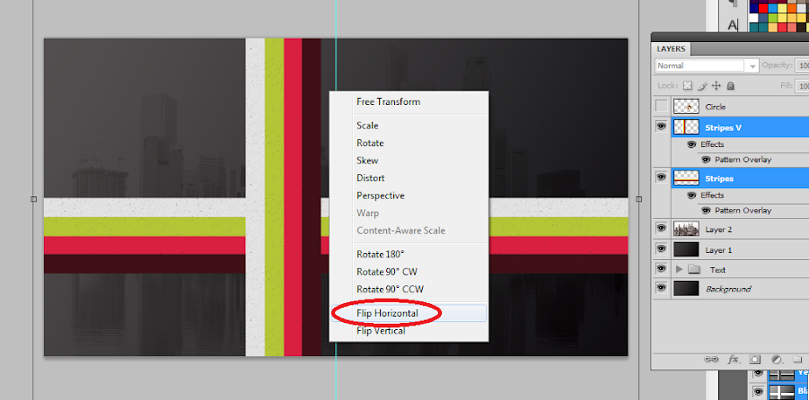
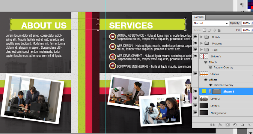
13. Next, we add some stripes. We use the rectangle shape tool to create four striped colors that span the whole width of our design. Of course, we purposefully aligned them so that it passes through and behind our circle shapes with the logo. We also grouped them into their own layer group so that they are easier to move together.
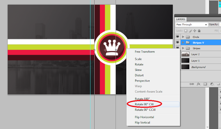
14. We duplicate the stripe group by just selecting the group folder, right clicking on it and clicking on the option to “duplicate group”. Once duplicated, we press CTRL+T on the duplicate group to transform it. Right click on the group and select the transform option “Rotate 90 degrees CW”. This gives us a vertical stripe. We have positioned it here adjacent and behind our circular logo.
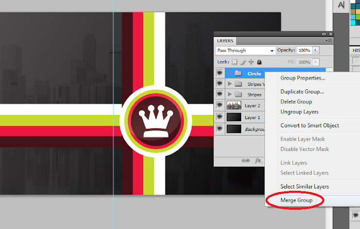
15. Great! Now we will finalize the stripes and logo. Make sure to give a final look to the positions of your stripes and logos. Adjust them as necessary of course. It should be easy as they are grouped already. Once you are satisfied with their locations, right click on one of your stripe groups or the circle group and then select the option to “merge groups”. Do this for each of the groups we created.
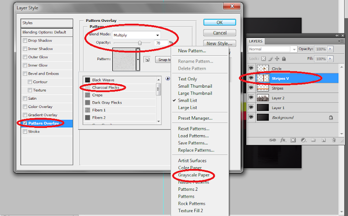
16. Double click on one of our stripes layers to bring up its layer style options. Click on the option “pattern overlay”. Set the blend mode to Multiply and the opacity to 70%. Then, choose the Charcoal Flecks pattern as the pattern for this option If you do not see this, click on the right arrow beside the patterns list and select “grayscale paper”. This should help you see the “Charcoal Flecks” option. Once done, do the same for your other stripe.
17. The end result should be a slightly more interesting looking stripe set.
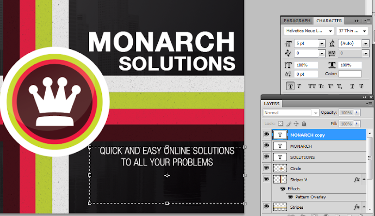
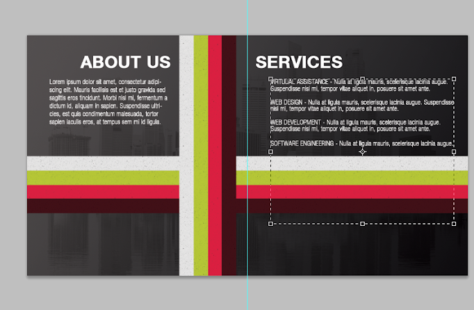
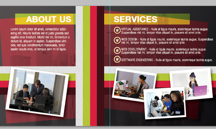
18. Great! Now, we just type in the title and other supporting text for the brochure cover. Use the text type tool of course to do this. Note that you can easily adjust the spacing and other attributes of text by looking at the character panel and adjusting the values as necessary.
19. Of course, we also write in the text content for the back cover of our brochure. Just use the same color and font style that you used on the front cover to keep things consistent.
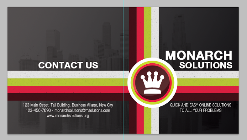
20. Great! That finishes our front design. It should look more or less like this. Take note of where the guideline is (light blue line) which should tell you where the fold should occur. Save this design of course as the front cover of your brochure.
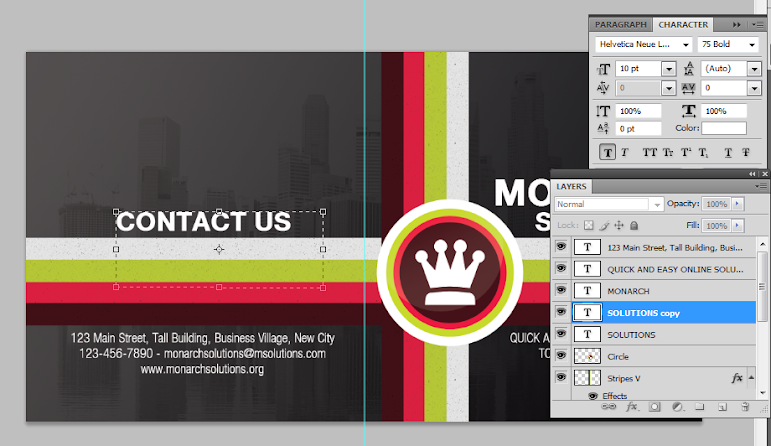
21. Now, we work on the back design or the inner panels for the brochure. There are two ways to start out with this. One is to use the template we saved earlier, or two, use our current design, but of course save it in another file name. The easiest of course is to save it as another file and mark is as the inner panel design. So we saved the new document as the inner panels of our half fold brochure. We then remove the visibility of all the elements leaving the background just so that we have a clean slate to start on.
22. Good! Now, we make the stripes visible again. This time we select both and press CTRL+T to activate the transformation. Then we right click on the stripes and select the option to “Flip Horizontal”. This allows our stripes to match and continue the stripes from the other side.
23. Next, we type in the inner content. It is best to use the same font styles as the front, but of course of a smaller size. Of course make sure to distinguish between the headlines and the main text.
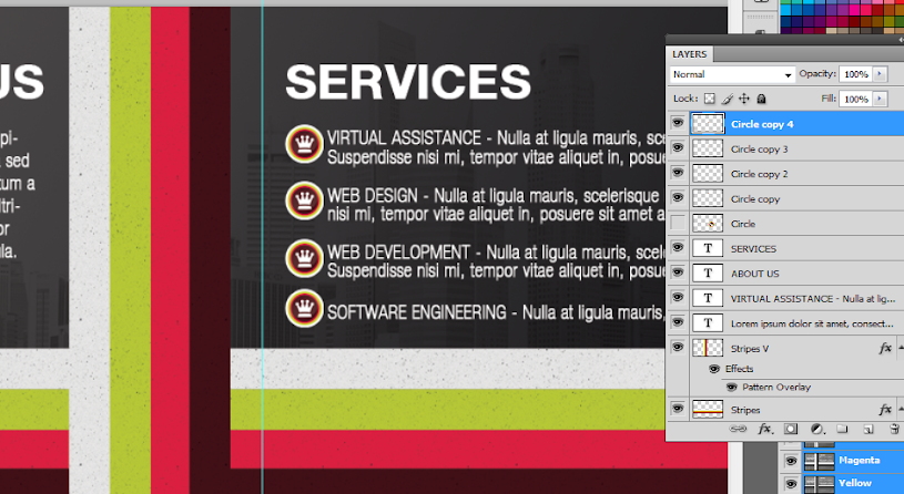
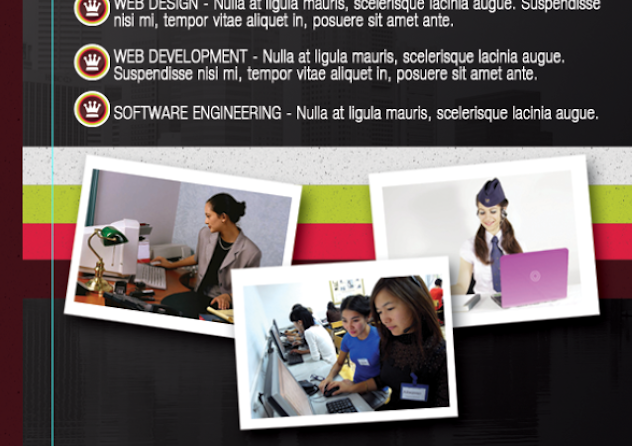
24. We then unhide the circle logo we created for the front cover design. We scale it down and duplicate it several times to become our bullets for the list content. Alternatively, you can search for your own styled bullet shape using the custom shape tool.
25. Now, using the rectangle shape tool create a few more white rectangles for the bottom of our design. These will be the base for images.
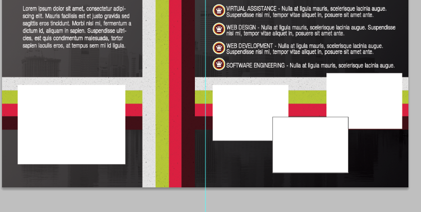
26. Great! Now, we paste in an image in front of each of these rectangles. Our image sources are here:
a. http://www.flickr.com/photos/76266195@N08/6939482080/sizes/z/in/photostream/
b. http://www.flickr.com/photos/30182867@N05/6447504471/sizes/l/in/photostream/
c. http://www.flickr.com/photos/marcinmonko/6172327422/sizes/l/in/photostream/
d. http://www.morguefile.com/archive/display/644927
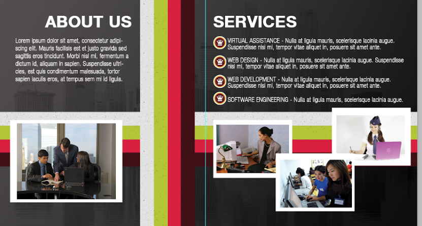
27. We then merge each image with its white rectangle by just selecting both and then right clicking on them to choose the merge layers option. Afterward, press CTRL+T and rotate these images creatively.
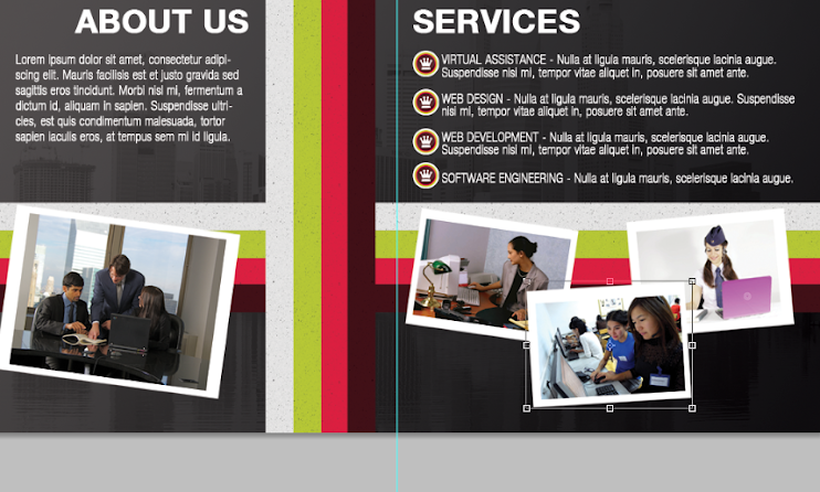
28. Now, double click on one of our images. Then on the layer styles window that opens, click on the option for “drop shadow”. Change the distance to 10 and the size to 15.
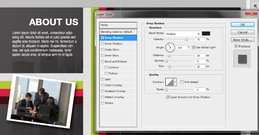
29. Then, just apply the same layer style to all those other images. You can easily copy existing layer styles by just right clicking on the layer with the style and selecting the option to copy the layer style. Then you just select where you want to paste the layer style, right click on them and then just select the option to paste in the style information.
30. Finally, to add some emphasis on our sub headlines, we use a rectangle tool to inscribe a rectangle shape just behind them. Make sure you use a theme color for this.
31. Then, change the blend mode to overlay, to proper integrate the color rectangle with the design.
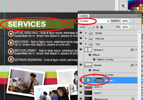
32. Repeat the process this time using more rectangles of a different color. Overlap them with each other for a creative style effect.
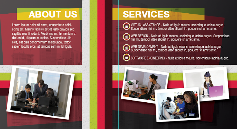
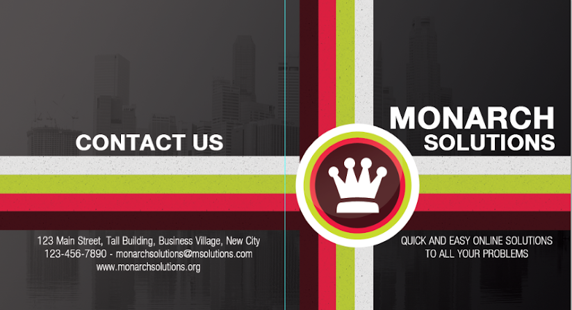
33. Great! That should finish our half- fold brochure! Hope you learn a lot from this guide. Below are the final images for the front and back design of our half fold brochure.
1. Upon opening Adobe Photoshop, create a new document by going to File->New… In the window that opens. You will then be asked to enter the dimensions of your design. This can vary depending on the brochure size you wish to use but for the sake of our tutorial, let us use a standard 1100x600px design canvass. ALSO take note to raise the resolution value to at least 300ppi to ensure a crisp and clear brochure design. Also change the color mode to CMYK if you wish to print your brochure through a commercial printer.
2. With the new document open, bring up the rulers first by pressing CTRL+R. Now, from the left hand side ruler, click and drag a guideline to your canvass. It should be a light blue line. Position it at the center of our document at 550px away from the left or right edge of the document.
3. Great! Now, the first thing that we will work on in our brochure is its background. While it would be simple enough to use a white background, it is not recommended as it will make the brochure too boring and of course will hamper its performance. The best type of background these days for brochures and many other print designs is a gradient color background. To apply this simply use the gradient color tool in Adobe Photoshop. Simple set two colors as your foreground and background color and then use the gradient tool to apply a seamless color changing background for your layout.
4. The next step is adding a watermark image. Most business brochures and other classic and formal type brochures use watermark images. This is a nice way to populate your background with a texture, without making it too complicated for the design. It is very simple enough to do this. Simply copy and paste the image that you want to use as a watermark on top of our gradient background. Scale it correctly of course by pressing CTRL+T and then increasing/decreasing its size while holding the shift key. If it has color, it is best to de-saturate the image by pressing CTRL+SHIFT+U.
5. To make the image truly a watermark, we change its blend mode. Do this by looking at its layer details in the layer panel and changing its blend mode from Normal to “Overlay”. Then reduce its opacity to 20%. This should make it a true watermark integrated with our gradient color background.
6. Once done, now would be a good time to save your new document. This will be our base template for our brochure design (both front and back). Save it first as a template and the backup. Then, save it again with a name marking it as the front cover design for our brochure.
7. Great, now we start designing the front or outer cover of our brochure first. Remember that in printing, the front design of the brochure has the cover of the brochure on the right, and the “back” cover of the brochure on the left. This is considering this design will be folded of course. So we start with the front cover on the right panel. Here we used the elliptical shape tool to create a white circle where we will put the company logo. Hold down the shift key as you inscribe the circle to constrain its proportions.
8. We then duplicate this circle by pressing CTRL+J. We change its color to a theme color and then reduce its size a bit by pressing CTRL+T and then just adjusting the dimensions via the anchor points. To make things easier on you, hold down the SHIFT key and the ALT key as you do the resizing and you will see that the new shape will be centered as well as constrained with its dimensions in the process.
9. Repeat the process 2 more times to get a nice modern looking shape set. In this example we used different theme colors to get this nice effect.
10. To create a nice glow effect, create a new white circle on top of our other circles. Then rasterize this layer by right clicking on the shape layer and selecting the option to “rasterize”. Using a large and soft eraser brush, we erase the top part of the circle.
11. Then reduce the opacity of this layer to add that glossy sheen look. Here we reduced it to around 15%.
12. Then, we paste in the company logo for the brochure within the circle. In this kind of design, it is best to use a white color for the logo in silhouette form. For our example, we just use some of the custom shapes in Photoshop through the custom shape tool, but for your design of course, it should be your main logo or your main feature image for the brochure. We grouped all of these into their own layer group named “circle”. You can create layer groups by clicking on the “new layer group” icon on the bottom of the layers panel and then dragging all the layers that you want in that group folder.
13. Next, we add some stripes. We use the rectangle shape tool to create four striped colors that span the whole width of our design. Of course, we purposefully aligned them so that it passes through and behind our circle shapes with the logo. We also grouped them into their own layer group so that they are easier to move together.
14. We duplicate the stripe group by just selecting the group folder, right clicking on it and clicking on the option to “duplicate group”. Once duplicated, we press CTRL+T on the duplicate group to transform it. Right click on the group and select the transform option “Rotate 90 degrees CW”. This gives us a vertical stripe. We have positioned it here adjacent and behind our circular logo.
15. Great! Now we will finalize the stripes and logo. Make sure to give a final look to the positions of your stripes and logos. Adjust them as necessary of course. It should be easy as they are grouped already. Once you are satisfied with their locations, right click on one of your stripe groups or the circle group and then select the option to “merge groups”. Do this for each of the groups we created.
16. Double click on one of our stripes layers to bring up its layer style options. Click on the option “pattern overlay”. Set the blend mode to Multiply and the opacity to 70%. Then, choose the Charcoal Flecks pattern as the pattern for this option If you do not see this, click on the right arrow beside the patterns list and select “grayscale paper”. This should help you see the “Charcoal Flecks” option. Once done, do the same for your other stripe.
17. The end result should be a slightly more interesting looking stripe set.
18. Great! Now, we just type in the title and other supporting text for the brochure cover. Use the text type tool of course to do this. Note that you can easily adjust the spacing and other attributes of text by looking at the character panel and adjusting the values as necessary.
19. Of course, we also write in the text content for the back cover of our brochure. Just use the same color and font style that you used on the front cover to keep things consistent.
20. Great! That finishes our front design. It should look more or less like this. Take note of where the guideline is (light blue line) which should tell you where the fold should occur. Save this design of course as the front cover of your brochure.
21. Now, we work on the back design or the inner panels for the brochure. There are two ways to start out with this. One is to use the template we saved earlier, or two, use our current design, but of course save it in another file name. The easiest of course is to save it as another file and mark is as the inner panel design. So we saved the new document as the inner panels of our half fold brochure. We then remove the visibility of all the elements leaving the background just so that we have a clean slate to start on.
22. Good! Now, we make the stripes visible again. This time we select both and press CTRL+T to activate the transformation. Then we right click on the stripes and select the option to “Flip Horizontal”. This allows our stripes to match and continue the stripes from the other side.
23. Next, we type in the inner content. It is best to use the same font styles as the front, but of course of a smaller size. Of course make sure to distinguish between the headlines and the main text.
24. We then unhide the circle logo we created for the front cover design. We scale it down and duplicate it several times to become our bullets for the list content. Alternatively, you can search for your own styled bullet shape using the custom shape tool.
25. Now, using the rectangle shape tool create a few more white rectangles for the bottom of our design. These will be the base for images.
26. Great! Now, we paste in an image in front of each of these rectangles. Our image sources are here:
a. http://www.flickr.com/photos/76266195@N08/6939482080/sizes/z/in/photostream/
b. http://www.flickr.com/photos/30182867@N05/6447504471/sizes/l/in/photostream/
c. http://www.flickr.com/photos/marcinmonko/6172327422/sizes/l/in/photostream/
d. http://www.morguefile.com/archive/display/644927
27. We then merge each image with its white rectangle by just selecting both and then right clicking on them to choose the merge layers option. Afterward, press CTRL+T and rotate these images creatively.
28. Now, double click on one of our images. Then on the layer styles window that opens, click on the option for “drop shadow”. Change the distance to 10 and the size to 15.
29. Then, just apply the same layer style to all those other images. You can easily copy existing layer styles by just right clicking on the layer with the style and selecting the option to copy the layer style. Then you just select where you want to paste the layer style, right click on them and then just select the option to paste in the style information.
30. Finally, to add some emphasis on our sub headlines, we use a rectangle tool to inscribe a rectangle shape just behind them. Make sure you use a theme color for this.
31. Then, change the blend mode to overlay, to proper integrate the color rectangle with the design.
32. Repeat the process this time using more rectangles of a different color. Overlap them with each other for a creative style effect.
33. Great! That should finish our half- fold brochure! Hope you learn a lot from this guide. Below are the final images for the front and back design of our half fold brochure.
... link (0 Kommentare) ... comment
Sonntag, 8. Juli 2012
Designing simple but stylish Eco Themed brochures using Photoshop
ilovegraphics, 08:51h
While designing brochures is a bit tricky given its folded nature, creating a simple but very stylish eco themed brochure is still fairly easy using Photoshop. Although you don’t have to have an expert skill set in Photoshop, you will need to be a bit more creative to fully maximize the tips and tricks you will learn here. So be sure to have an eager mind with a creative mindset and learning how to design a modern corporate “green” brochure in Adobe Photoshop should be a breeze.
1. The first task is to setup our document properly. In this tutorial, we will be creating a trifold brochure in a landscape letter sized paper. We chose this size and orientation so that most people may be able to print them at the office or at home (though professional help is always recommended), through a good commercial printer - I personally vouch for brochures printed by PrintPlace. Just follow the dimensions like so:
a. Width: 11 inches
b. Height: 8.5 inches
c. Resolution: 300ppi
d. Color mode: CMYK

2. Great! Now, with the document open, we will add our guides. Technically you will want a bleed to compensate for cutting. However, take note that we are using a letter size dimension here, meaning this document Is meant to be printed using pre-cut letter sized paper. So we just need to place in some basic 0.25 inch bleed/margin lines for printing. You can do this easily by click dragging a guideline from the rulers. If the rulers are missing press CTRL+R.

3. Finally, before we start with our design, you of course must also add guidelines for the fold of the trifold brochure. Counting 3.5 inches from the edge of our left and right margins, place 2 more guidelines marking the folds. Note that some people also add “security lines” which are 0.25 inches away from these guidelines. Place them if you also want this feature.

4. Great! Now we start by adding a gradient background. Gradient color backgrounds are usually more recommended that just plain colors, as this adds some dynamism and a less artificial look to the design. So use the gradient tool and choose two theme colors of your choice to paint a diagonal color gradient for your background. Take note that you can set the colors automatically for the gradient by choosing your foreground and background colors respectively. For our example, we will be using some green hues as our mock company will be an ecological type company.

5. Save this document for now as your main template. This is because we will be designing the front and the back side of the brochure of course. Once you save the template initially, re-save the document again, this time indicating that this is the front side of the brochure, the one that becomes the inner content. Just press CTRL+SHIFT+S to start saving the document as a new file.

6. Great! Now that we know this is the front design and inner panel content of our brochure, we shall now place in some specific content. The first thing we will add is some content boxes/shapes. For our example, we are first going to place in a rounded rectangle in one of the panels. Just use the rounded rectangle shape tool to do this. We color this a very light green in line with our theme. Remember to not trespass the shape on our guidelines of course.

7. Now, press CTRL+T to transform the shape. Right click on it to bring up its context menu. Choose “Skew” and then skew the shape a bit to your specifications.

8. Next, we duplicate the shape by pressing CTRL+J. Transform the duplicate again by pressing CTRL+T and then right click on it. Select, “Flip horizontal” and then move the shape to the rightmost panel. This gives us 2 text boxes in symmetry with each other.

9. Now, using the custom shape tool, we add in some flower and plat shapes on the borders of our text boxes. Just choose some creative custom shapes on your own and place them (with the same color) along the sides of the text boxes for a creative effect.

10. Just repeat the whole process of adding small images and integrating them into the text boxes as you see fit. Once done, save them in a layer group so that you can organize your layers.

11. Good, now a typical addition to most brochures are watermark images. Watermark image enhance the communication of the theme and of course adds some all important texture in the background of brochures. So here in our example we add in some pictures of solar panels just above the background gradient but of course behind the text boxes. We reduce their opacity to around 20-30%.

12. To emphasize the center, we create a new layer by pressing CTRL+SHIFT+N. Then, with a large soft brush, we brush in a soft red stripe across the center. It does not have to be perfect. Reduce its opacity to 60%.

13. Then, we paste in the company logo right at the middle of your brochure design. Make sure to resize it properly of course.

14. Next, we add in the text information for the brochure. We first add the headlines and then the body text. We use the Text tool of course to do this. Make sure to position these carefully, especially if you plan on adding additional images to the brochure.

15. Then we just paste in the supplemental images for the brochure. Just copy and paste them unto the design. Do not forget to crop them and scale them properly of course. Scale them by pressing the SHIFT key whilst you transform them using the CTRL+T transform action. Crop them by using the rectangular marquee tool and then just pressing backspace.

16. As the final effect for this front part we add layer styles. Double click on the logo layer to bring out its layer styles. Click on the drop shadow effect and use a distance of 1 and size of 5 for the shadow.

17. Finally, add a outer glow blend mode. Change the color of the glow to a light green glow and set the size to around 21px.

18. That finishes the front part of our brochure!

19. We now start with the front. Remember the initial template that we created earlier? Open it up and then create a new save that indicates this new file as the back, or outer side of the brochure. Once saved, you can now start with this outer cover design. Take note that in the trifold brochure this back/outer part is made up of the “cover” (right most panel), the “brochure back” (middle panel), and the “inner flap” (the left most panel). In our example, we placed the logo in the right most panel as it is the cover of the brochure.

20. We then just complete the brochure cover design at the rightmost panel by adding a graphic feature and slogan.

21. For the back panel in the middle, we combined to basic custom shapes (a flower and the telephone sign) to create this nice graphic effect. We copy and paste the same layer styles we used on the logo to this graphic. We then of course type in the supplemental text below.

22. Finally, using the same techniques that we used in the inner panels, we create shapes as text boxes and then type in the appropriate kinds of text on top of them.

23. Great! That should finish our Back/Outer brochure design! Now just combine this with our initial front layer before and you should have our completed full color eco themed corporate brochure. Congratulations!

1. The first task is to setup our document properly. In this tutorial, we will be creating a trifold brochure in a landscape letter sized paper. We chose this size and orientation so that most people may be able to print them at the office or at home (though professional help is always recommended), through a good commercial printer - I personally vouch for brochures printed by PrintPlace. Just follow the dimensions like so:
a. Width: 11 inches
b. Height: 8.5 inches
c. Resolution: 300ppi
d. Color mode: CMYK
2. Great! Now, with the document open, we will add our guides. Technically you will want a bleed to compensate for cutting. However, take note that we are using a letter size dimension here, meaning this document Is meant to be printed using pre-cut letter sized paper. So we just need to place in some basic 0.25 inch bleed/margin lines for printing. You can do this easily by click dragging a guideline from the rulers. If the rulers are missing press CTRL+R.
3. Finally, before we start with our design, you of course must also add guidelines for the fold of the trifold brochure. Counting 3.5 inches from the edge of our left and right margins, place 2 more guidelines marking the folds. Note that some people also add “security lines” which are 0.25 inches away from these guidelines. Place them if you also want this feature.
4. Great! Now we start by adding a gradient background. Gradient color backgrounds are usually more recommended that just plain colors, as this adds some dynamism and a less artificial look to the design. So use the gradient tool and choose two theme colors of your choice to paint a diagonal color gradient for your background. Take note that you can set the colors automatically for the gradient by choosing your foreground and background colors respectively. For our example, we will be using some green hues as our mock company will be an ecological type company.
5. Save this document for now as your main template. This is because we will be designing the front and the back side of the brochure of course. Once you save the template initially, re-save the document again, this time indicating that this is the front side of the brochure, the one that becomes the inner content. Just press CTRL+SHIFT+S to start saving the document as a new file.
6. Great! Now that we know this is the front design and inner panel content of our brochure, we shall now place in some specific content. The first thing we will add is some content boxes/shapes. For our example, we are first going to place in a rounded rectangle in one of the panels. Just use the rounded rectangle shape tool to do this. We color this a very light green in line with our theme. Remember to not trespass the shape on our guidelines of course.
7. Now, press CTRL+T to transform the shape. Right click on it to bring up its context menu. Choose “Skew” and then skew the shape a bit to your specifications.
8. Next, we duplicate the shape by pressing CTRL+J. Transform the duplicate again by pressing CTRL+T and then right click on it. Select, “Flip horizontal” and then move the shape to the rightmost panel. This gives us 2 text boxes in symmetry with each other.
9. Now, using the custom shape tool, we add in some flower and plat shapes on the borders of our text boxes. Just choose some creative custom shapes on your own and place them (with the same color) along the sides of the text boxes for a creative effect.
10. Just repeat the whole process of adding small images and integrating them into the text boxes as you see fit. Once done, save them in a layer group so that you can organize your layers.
11. Good, now a typical addition to most brochures are watermark images. Watermark image enhance the communication of the theme and of course adds some all important texture in the background of brochures. So here in our example we add in some pictures of solar panels just above the background gradient but of course behind the text boxes. We reduce their opacity to around 20-30%.
12. To emphasize the center, we create a new layer by pressing CTRL+SHIFT+N. Then, with a large soft brush, we brush in a soft red stripe across the center. It does not have to be perfect. Reduce its opacity to 60%.
13. Then, we paste in the company logo right at the middle of your brochure design. Make sure to resize it properly of course.
14. Next, we add in the text information for the brochure. We first add the headlines and then the body text. We use the Text tool of course to do this. Make sure to position these carefully, especially if you plan on adding additional images to the brochure.
15. Then we just paste in the supplemental images for the brochure. Just copy and paste them unto the design. Do not forget to crop them and scale them properly of course. Scale them by pressing the SHIFT key whilst you transform them using the CTRL+T transform action. Crop them by using the rectangular marquee tool and then just pressing backspace.
16. As the final effect for this front part we add layer styles. Double click on the logo layer to bring out its layer styles. Click on the drop shadow effect and use a distance of 1 and size of 5 for the shadow.
17. Finally, add a outer glow blend mode. Change the color of the glow to a light green glow and set the size to around 21px.
18. That finishes the front part of our brochure!
19. We now start with the front. Remember the initial template that we created earlier? Open it up and then create a new save that indicates this new file as the back, or outer side of the brochure. Once saved, you can now start with this outer cover design. Take note that in the trifold brochure this back/outer part is made up of the “cover” (right most panel), the “brochure back” (middle panel), and the “inner flap” (the left most panel). In our example, we placed the logo in the right most panel as it is the cover of the brochure.
20. We then just complete the brochure cover design at the rightmost panel by adding a graphic feature and slogan.
21. For the back panel in the middle, we combined to basic custom shapes (a flower and the telephone sign) to create this nice graphic effect. We copy and paste the same layer styles we used on the logo to this graphic. We then of course type in the supplemental text below.
22. Finally, using the same techniques that we used in the inner panels, we create shapes as text boxes and then type in the appropriate kinds of text on top of them.
23. Great! That should finish our Back/Outer brochure design! Now just combine this with our initial front layer before and you should have our completed full color eco themed corporate brochure. Congratulations!
... link (0 Kommentare) ... comment
Mittwoch, 4. Juli 2012
Classic Old World - Renaissance Style Poster Tutorial
ilovegraphics, 20:22h
In this tutorial, we will teach you how to achieve an old world, renaissance type poster design. Let’s begin.
1. The first step is to setup our document. Once Adobe Photoshop is open, simply press CTRL N to create a new document. For posters, a portrait orientation is required. The set dimension should be provided to you by your printer. Otherwise, you may want to use standard dimensions. Here in our example, we have used an 11x17 inch dimension at a 300ppi resolution. We used a high resolution as our image will be set for print.

2. Initially, we will work on our background first. A plain white color of course is not enough. Using the Gradient Tool, we paint up our poster background with a dark green gradient like so. For our example we used these colors: (005952-012421). Of course, you can change this to whatever color theme that you may like.

3. Then, we paste in a banner vector clip-art. There are plenty of different kinds of FREE vector shapes like this. In fact, if you look at the Photoshop custom shape gallery, you should see plenty of shapes for banners. So just look for something that will fit your theme. Do not worry about the colors as we will work with it. For now though, make sure you scale it properly as a vector. Press CTRL T and adjust the dimensions and warping as well if needed.

4. Great! Now we will put our theme colors into the banner. Using the magic wand tool, select the white areas of the banner. Create a new layer and then paint the selected sections with a beige color.

5. Now, we will dirty up this base color for the banner a bit. Using the Burn tool we will darken our banner with some “dirt”. To do this, we are using some grunge brushes that we got for free over the Internet. Here we are using T9 Dirty Sprays.

6. Next, we are going to use the dodge tool. This time, a large soft white brush is needed. We will lighten the central area of the banner to simulate some subtle light that comes from the forward area of the design.

7. Now, hold down the CTRL key and click on the image thumbnail of our light colored banner layer. This will select the area that it spans. Go to Select - Modify - Contract. In the window that opens choose 5-8 pixels depending on how large or small your banner is. This will reduce the selection a bit.

8. Then, with a new layer selected, fill the selection with a dark green color. You will see that our base color will become a border whilst the top layer becomes our main banner area.

9. Good! Now just like before, use the burn tool again to darken the edge parts of the banner, whilst subtly leaving the central area lighter. This gives us a very subliminal kind of emphasis that is great.

10. Next, select the original banner vector layer again. Use the magic wand tool to select the bottom black parts of our banner. Create a new layer and then with those black areas selected and the new layer active paint it a dark blue (or a theme color of your choice),

11. Then, once again, using either the dodge tool or the burn tool, use grunge brushes too add lighter and darker variations in this bottom area of our banner.

12. Now, using the type tool, write in the title to be placed into the banner. Make sure that you use a font that is appropriate for the theme. Here we are using a script font named Arabella. Color it close to the border Hue of the banner.

13. Now, click on the “Warp Text” icon in the text attribute menu bar that appears when you have text selected,. Change the style to “Arc”. Then adjust the bend so that the bend of the text matches our banner.

14. Great! Now, we are going to make our text look a lot more golden. To do this we will be using five layer styles and blending options. So double click on our text to get us started. Once the layer styles window is open, first click on “inner shadow”. Then change the values as follows:
a. Blend Mode : Multiply, Color: #ffeab6
b. Angle: 120 degrees
c. Size: 13

15. Next, click on Inner Glow. Change these values:
a. Size: 13
b. Contour: “Rounded Steps”
c. Range: 50 percent

16. Afterwards, click on Satin. Use these properties.
a. Blend Mode: Linear Dodge (Add), Color: ffda75
b. Opacity: 52 percent
c. Angle: 19 degrees
d. Distance: 15px
e. Size: 97px
f. Contour: Gaussian, Click on “Invert”

17. Click also of course on “Gradient Overlay”. Change the values to these settings.
a. Opacity: 4
b. Gradient Color: 97461a-fbd8c5-6c2e16-efdbcd

18. Finally, click on “Stroke”. Use these values.
a. Size: 3px
b. Color: 32424a

19. That should finish our banner design. It should look something like this.

20. Next, we work on the background. To make things easier, we created a new layer group named banner and shifted all the banner layers to this group. Then, we disabled its visibility as we work on the background.

21. Now, with our background ready, we paste in a texture to add some detail to it. Here we pasted in a rough wall texture. We de-saturated the texture layer by pressing CTRL SHIFT U. Then we changed the blend mode to “Overlay”.

22. To make the background look darker, we created a new layer on top of the texture layer. We filled it with dark grey color, changed its opacity to 40 percent, and finally we set the blend mode to “Overlay”.

23. The next part is where we process some renaissance type graphics. On a separate document, we opened up a renaissance type sketch. We de-saturated it (CTRL SHIFT U) and then adjusted its Levels and the Brightness/Contrast to get it to look like this.

24. We paste in our sketch layer to our poster design. To remove the white, we change the blend mode to “Multiply”. Then we reduce its opacity to around 70 percent.

25. For more lighting effects, we use the custom shape tool and place in the shape “Tile 2” over our design.

26. Set this shape’s blending mode to Overlay. Then, go to Filter - Blur - Guassian Blur. Use a 10 pixel distribution to add a more fuzzy lighting effect to our poster. Once done, erase parts of the edges to make the shadow and lighting effect look more seamless.

27. Next, create a new layer on top of the lights layer. With a very large and soft brush, paint a beige spot in the middle. Set this layer’s blend mode to “Screen”.

28. Duplicate this bright spot by pressing CTRL J. Then go to Filter - Distort - Wave. Use these values:
a. Number of generators: 15
b. Wavelength: 10 -180
c. Amplitude: 3-35
d. Scale 100 percent both

29. Now, keep pressing CTRL F to repeat the filter several times. The effect for waves is randomized so you may get a different effect. Just make sure that the waves extend from our central point a bit to make the background more interesting.

30. Create another layer. This time use some grunge brushes in black color to pain some dirt over our bright spots.

31. Change their blending mode to “Overlay” and reduce the opacity to 40 percent.

32. We add more details still. Here we use the text tool to fill out our poster design with lines and lines of text. This will help us add more texture and add that old world text theme to our poster design. Use a script font for here as well, and a beige color as well.

33. We change the text’s blend mode to “Hard Light”. Then we reduce the opacity by 40 percent. We also tilted the text a bit by pressing CTRL T and then rotating text a bit.

34. We will now add a darker border to our poster design. Create another layer on top of our banner group. Use a large soft black brush and brush in a fuzzy border around our design. Change its blend mode to Overlay as well.

35. Now, we will add some cloud effects. Create another new layer on top of all the other layers. Set your foreground color to this color (deb883) and then set the background color to (745222). Then go to Filter - Render - Clouds.

36. Change the blend mode of the cloud layer to “Color” and then use an opacity of 45 percent.

37. We then add our main poster feature image. Since the theme is old world and renaissance, we placed in here a very impressive looking renaissance era Astrolabe. This of course was processed a bit as we removed the background already. We scaled it properly and just placed it at the center.

38. We then add a shadow for our astrolabe. Double click on its layer, and then click on “Drop Shadow”. Change these values:
a. Distance: 0
b. Spread: 20px
c. Size: 30px

39. Then, we just unhide our banner that we did earlier. We place it below our Astrolabe.

40. Great! With all those elements we have finished our great old world renaissance style color poster. You can also apply this design style when designing and printing brochures, postcards or other marketing media.

1. The first step is to setup our document. Once Adobe Photoshop is open, simply press CTRL N to create a new document. For posters, a portrait orientation is required. The set dimension should be provided to you by your printer. Otherwise, you may want to use standard dimensions. Here in our example, we have used an 11x17 inch dimension at a 300ppi resolution. We used a high resolution as our image will be set for print.
2. Initially, we will work on our background first. A plain white color of course is not enough. Using the Gradient Tool, we paint up our poster background with a dark green gradient like so. For our example we used these colors: (005952-012421). Of course, you can change this to whatever color theme that you may like.
3. Then, we paste in a banner vector clip-art. There are plenty of different kinds of FREE vector shapes like this. In fact, if you look at the Photoshop custom shape gallery, you should see plenty of shapes for banners. So just look for something that will fit your theme. Do not worry about the colors as we will work with it. For now though, make sure you scale it properly as a vector. Press CTRL T and adjust the dimensions and warping as well if needed.
4. Great! Now we will put our theme colors into the banner. Using the magic wand tool, select the white areas of the banner. Create a new layer and then paint the selected sections with a beige color.
5. Now, we will dirty up this base color for the banner a bit. Using the Burn tool we will darken our banner with some “dirt”. To do this, we are using some grunge brushes that we got for free over the Internet. Here we are using T9 Dirty Sprays.
6. Next, we are going to use the dodge tool. This time, a large soft white brush is needed. We will lighten the central area of the banner to simulate some subtle light that comes from the forward area of the design.
7. Now, hold down the CTRL key and click on the image thumbnail of our light colored banner layer. This will select the area that it spans. Go to Select - Modify - Contract. In the window that opens choose 5-8 pixels depending on how large or small your banner is. This will reduce the selection a bit.
8. Then, with a new layer selected, fill the selection with a dark green color. You will see that our base color will become a border whilst the top layer becomes our main banner area.
9. Good! Now just like before, use the burn tool again to darken the edge parts of the banner, whilst subtly leaving the central area lighter. This gives us a very subliminal kind of emphasis that is great.
10. Next, select the original banner vector layer again. Use the magic wand tool to select the bottom black parts of our banner. Create a new layer and then with those black areas selected and the new layer active paint it a dark blue (or a theme color of your choice),
11. Then, once again, using either the dodge tool or the burn tool, use grunge brushes too add lighter and darker variations in this bottom area of our banner.
12. Now, using the type tool, write in the title to be placed into the banner. Make sure that you use a font that is appropriate for the theme. Here we are using a script font named Arabella. Color it close to the border Hue of the banner.
13. Now, click on the “Warp Text” icon in the text attribute menu bar that appears when you have text selected,. Change the style to “Arc”. Then adjust the bend so that the bend of the text matches our banner.
14. Great! Now, we are going to make our text look a lot more golden. To do this we will be using five layer styles and blending options. So double click on our text to get us started. Once the layer styles window is open, first click on “inner shadow”. Then change the values as follows:
a. Blend Mode : Multiply, Color: #ffeab6
b. Angle: 120 degrees
c. Size: 13
15. Next, click on Inner Glow. Change these values:
a. Size: 13
b. Contour: “Rounded Steps”
c. Range: 50 percent
16. Afterwards, click on Satin. Use these properties.
a. Blend Mode: Linear Dodge (Add), Color: ffda75
b. Opacity: 52 percent
c. Angle: 19 degrees
d. Distance: 15px
e. Size: 97px
f. Contour: Gaussian, Click on “Invert”
17. Click also of course on “Gradient Overlay”. Change the values to these settings.
a. Opacity: 4
b. Gradient Color: 97461a-fbd8c5-6c2e16-efdbcd
18. Finally, click on “Stroke”. Use these values.
a. Size: 3px
b. Color: 32424a
19. That should finish our banner design. It should look something like this.
20. Next, we work on the background. To make things easier, we created a new layer group named banner and shifted all the banner layers to this group. Then, we disabled its visibility as we work on the background.
21. Now, with our background ready, we paste in a texture to add some detail to it. Here we pasted in a rough wall texture. We de-saturated the texture layer by pressing CTRL SHIFT U. Then we changed the blend mode to “Overlay”.
22. To make the background look darker, we created a new layer on top of the texture layer. We filled it with dark grey color, changed its opacity to 40 percent, and finally we set the blend mode to “Overlay”.
23. The next part is where we process some renaissance type graphics. On a separate document, we opened up a renaissance type sketch. We de-saturated it (CTRL SHIFT U) and then adjusted its Levels and the Brightness/Contrast to get it to look like this.
24. We paste in our sketch layer to our poster design. To remove the white, we change the blend mode to “Multiply”. Then we reduce its opacity to around 70 percent.
25. For more lighting effects, we use the custom shape tool and place in the shape “Tile 2” over our design.
26. Set this shape’s blending mode to Overlay. Then, go to Filter - Blur - Guassian Blur. Use a 10 pixel distribution to add a more fuzzy lighting effect to our poster. Once done, erase parts of the edges to make the shadow and lighting effect look more seamless.
27. Next, create a new layer on top of the lights layer. With a very large and soft brush, paint a beige spot in the middle. Set this layer’s blend mode to “Screen”.
28. Duplicate this bright spot by pressing CTRL J. Then go to Filter - Distort - Wave. Use these values:
a. Number of generators: 15
b. Wavelength: 10 -180
c. Amplitude: 3-35
d. Scale 100 percent both
29. Now, keep pressing CTRL F to repeat the filter several times. The effect for waves is randomized so you may get a different effect. Just make sure that the waves extend from our central point a bit to make the background more interesting.
30. Create another layer. This time use some grunge brushes in black color to pain some dirt over our bright spots.
31. Change their blending mode to “Overlay” and reduce the opacity to 40 percent.
32. We add more details still. Here we use the text tool to fill out our poster design with lines and lines of text. This will help us add more texture and add that old world text theme to our poster design. Use a script font for here as well, and a beige color as well.
33. We change the text’s blend mode to “Hard Light”. Then we reduce the opacity by 40 percent. We also tilted the text a bit by pressing CTRL T and then rotating text a bit.
34. We will now add a darker border to our poster design. Create another layer on top of our banner group. Use a large soft black brush and brush in a fuzzy border around our design. Change its blend mode to Overlay as well.
35. Now, we will add some cloud effects. Create another new layer on top of all the other layers. Set your foreground color to this color (deb883) and then set the background color to (745222). Then go to Filter - Render - Clouds.
36. Change the blend mode of the cloud layer to “Color” and then use an opacity of 45 percent.
37. We then add our main poster feature image. Since the theme is old world and renaissance, we placed in here a very impressive looking renaissance era Astrolabe. This of course was processed a bit as we removed the background already. We scaled it properly and just placed it at the center.
38. We then add a shadow for our astrolabe. Double click on its layer, and then click on “Drop Shadow”. Change these values:
a. Distance: 0
b. Spread: 20px
c. Size: 30px
39. Then, we just unhide our banner that we did earlier. We place it below our Astrolabe.
40. Great! With all those elements we have finished our great old world renaissance style color poster. You can also apply this design style when designing and printing brochures, postcards or other marketing media.
... link (0 Kommentare) ... comment
... older stories