... newer stories
Sonntag, 1. Juli 2012
Designing a modern colorful brochure cover
ilovegraphics, 18:26h
While there is the emphasis of being minimalist in modern print design, to fully create an impressive looking brochure cover these days, you need to pay attention to key subtle details. It is not just about the colors or your overall color scheme. It is about adding gradients appropriately, glow and shine effects that is reminiscent of digital web designs.
In this tutorial, we will show you how you can design a modern brochure cover that is simple, colorful, but fully impressive and trendy, matching the latest successful designs both in print and in web layouts. So carefully read the items below and start learning how you can design your own modern and colorful brochure cover.
1. First we start with our document. Since this is just the cover, we will have the full height of the brochure, but just 1/3 of the width. Also, since this design is meant to be pasted to a full scale brochure template, the resolution is still at a high value. Here is the list of the best document setting values to use.
a. Height: 5 inches
b. Width: 9.5 inches
c. Resolution: 300ppi
d. Color Mode: CMYK

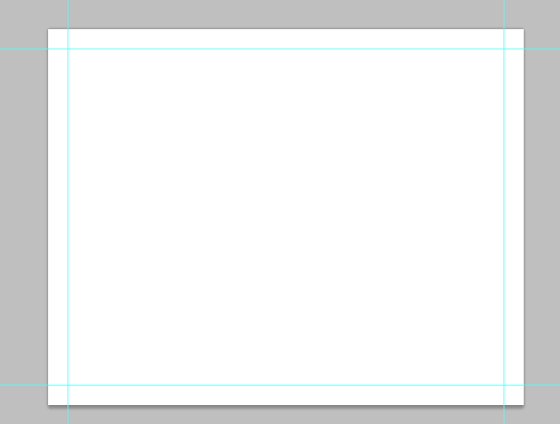
2. Next, we setup our guidelines. To do this, make sure that you have your rulers out. If not, press CTRL+R to make them visible. Now set a margin 0.5 inches on the top, bottom and right sides. We will not set up a bleed margin on the left side as this is the area that connects to the other part of the brochure. Once done, count a 0.25 inch security line from your margin lines (top, bottom right) as well as from the edge of the left side. This is the security line which should make you remember where design elements are better not placed. In the end, your sample document should be something like this:

3. First, we setup the background. While plain white is okay, today, it is best to use more dynamic gradient colors. So using the gradient tool we paint up a gradient color to the background. Here we used a green to light green gradient that goes from the bottom right of the cover design. Just choose the color scheme appropriate for your own brochure.

4. Create a new layer by pressing CTRL+SHIFT+N. Then, use the rectangle marquee tool to inscribe a tall rectangle shape. Fill the selection with a light green color.

5. Then, change the opacity of this layer to 20%. Afterwards, use a round and soft eraser brush tool to remove the hard edges at the top and left of the graphic.

6. Duplicate this reduced opacity layer and vary its position from the original. Once done, you may want to make more duplicates and place them all over your design like so.

7. Now, for our modern design, we will use color boxes for the content. We will use the rectangle shape tool to do this. So go select the rectangle shape tool and create a small rectangle. Choose a nice color for it that matches your theme.

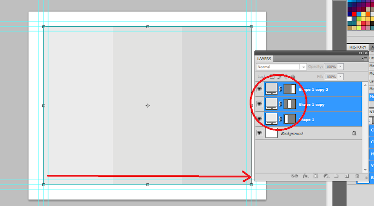
8. Now, just continue with creating rectangles of different sizes. Use a different theme color of your choice. Also, reserve large rectangle spaces for your main brochure images. In this example, we placed two large black rectangles for the images, and the rest are variations of smaller rectangles and squares.

9. Next, double click on one of the rectangles, to get to its layer style options. Click on the drop shadow option and use a 2px distance value with a size of 10.

10. Once done, right click on the layer and select the option to “copy layer style”.

11. Then, select all the other rectangle shapes and then right click on them. Choose the “Paste layer style” option to apply the shadow to all your boxes.

12. Great! Now let us add some pictures. First we paste in one of our main images. Place it on top of the shape where you want it to be placed. Remember that you can press CTRL+T to scale and resize images as needed.

13. Once done, right click on your image and look for the option to “Create Clipping Mask”. This should clip your images within the bounds as determined by the layer below.

14. Then, just repeat the process several times for all the images that you want inserted into our design.

15. Now, we type in our text. Add them to our color boxes of course. It is best to use white text here to contrast with the color. Use varying font styles as needed. Also do not forget that you can use the character panel to edit the spacing of your text.

16. Now we add some icons. Using the custom shape tool, we choose the appropriate icon shapes for the different color boxes. This should help people identify and remember the marketing slogans better.

17. Great! That finishes our modern and colorful brochure cover!

In this tutorial, we will show you how you can design a modern brochure cover that is simple, colorful, but fully impressive and trendy, matching the latest successful designs both in print and in web layouts. So carefully read the items below and start learning how you can design your own modern and colorful brochure cover.
1. First we start with our document. Since this is just the cover, we will have the full height of the brochure, but just 1/3 of the width. Also, since this design is meant to be pasted to a full scale brochure template, the resolution is still at a high value. Here is the list of the best document setting values to use.
a. Height: 5 inches
b. Width: 9.5 inches
c. Resolution: 300ppi
d. Color Mode: CMYK
2. Next, we setup our guidelines. To do this, make sure that you have your rulers out. If not, press CTRL+R to make them visible. Now set a margin 0.5 inches on the top, bottom and right sides. We will not set up a bleed margin on the left side as this is the area that connects to the other part of the brochure. Once done, count a 0.25 inch security line from your margin lines (top, bottom right) as well as from the edge of the left side. This is the security line which should make you remember where design elements are better not placed. In the end, your sample document should be something like this:
3. First, we setup the background. While plain white is okay, today, it is best to use more dynamic gradient colors. So using the gradient tool we paint up a gradient color to the background. Here we used a green to light green gradient that goes from the bottom right of the cover design. Just choose the color scheme appropriate for your own brochure.
4. Create a new layer by pressing CTRL+SHIFT+N. Then, use the rectangle marquee tool to inscribe a tall rectangle shape. Fill the selection with a light green color.
5. Then, change the opacity of this layer to 20%. Afterwards, use a round and soft eraser brush tool to remove the hard edges at the top and left of the graphic.
6. Duplicate this reduced opacity layer and vary its position from the original. Once done, you may want to make more duplicates and place them all over your design like so.
7. Now, for our modern design, we will use color boxes for the content. We will use the rectangle shape tool to do this. So go select the rectangle shape tool and create a small rectangle. Choose a nice color for it that matches your theme.
8. Now, just continue with creating rectangles of different sizes. Use a different theme color of your choice. Also, reserve large rectangle spaces for your main brochure images. In this example, we placed two large black rectangles for the images, and the rest are variations of smaller rectangles and squares.
9. Next, double click on one of the rectangles, to get to its layer style options. Click on the drop shadow option and use a 2px distance value with a size of 10.
10. Once done, right click on the layer and select the option to “copy layer style”.
11. Then, select all the other rectangle shapes and then right click on them. Choose the “Paste layer style” option to apply the shadow to all your boxes.
12. Great! Now let us add some pictures. First we paste in one of our main images. Place it on top of the shape where you want it to be placed. Remember that you can press CTRL+T to scale and resize images as needed.
13. Once done, right click on your image and look for the option to “Create Clipping Mask”. This should clip your images within the bounds as determined by the layer below.
14. Then, just repeat the process several times for all the images that you want inserted into our design.
15. Now, we type in our text. Add them to our color boxes of course. It is best to use white text here to contrast with the color. Use varying font styles as needed. Also do not forget that you can use the character panel to edit the spacing of your text.
16. Now we add some icons. Using the custom shape tool, we choose the appropriate icon shapes for the different color boxes. This should help people identify and remember the marketing slogans better.
17. Great! That finishes our modern and colorful brochure cover!
... link (0 Kommentare) ... comment
Continued from the tutorial: "How to create a brochure design that is ready for printing using Photoshop"
ilovegraphics, 18:24h
In this second part of our print ready brochure design, we will create the other side of our brochure. If the first brochure was about creating the outer side of the brochure, this one is about the Inner side. Let us start.
1. The starting point for the inside of our print ready brochure is actually the final product of our outer content. To make that layout as the base design, we simply delete the layers for its content. So all the text should be removed. Of course, make sure that the stripes, textures, and even the trim guides are left. Once done, save the document as a new file. The base layout should look like this:

2. The next step is to flip the stripes. To do this simply select the stripes in the layers panel. Then press CTRL+T to transform all the stripes. Right click on the transform box and choose “Flip Horizontal”.

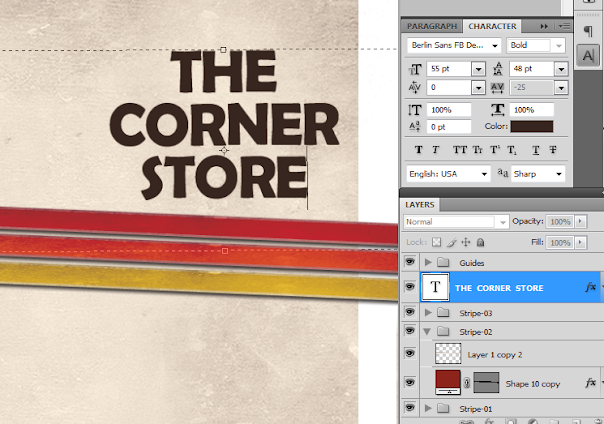
3. After the flip, we then type in our Inner Content. Just use the type tool again to do this. Also keep in mind our security guidelines and panels.

4. For an added effect, we also added some bullet point graphics. TO do this, we just used the custom shape tool, and used an arrow as the bullet point. Just go to the custom shape tool options and find the right bullet point that you want for your own design. Just place it at the right place in your content and duplicate it as necessary.

5. Now, we will add a support graphic. First we insert an image of an old postcard. For our particular design, we used this:http://www.flickr.com/photos/playingwithpsp/2951476659/sizes/o/in/photostream/
We adjusted the pasted image a bit so that it looks brighter by going to the Image -> Brightness/Contrast controls.

6. Before we do anything else though, we will process our main image for the postcard. In a separate document we open up our brochure print file. In this example we are using this image from flickr (http://www.flickr.com/photos/55935853@N00/4498482498/sizes/l/in/photostream/) by Ewan-M. Then we add a sepia color effect. With the image active, go to Image -> Adjustments -> Photo Filter. Set the filter to Sepia and up the density value to 100%.

7. Next, we paste in our supporting image to our main brochure design. In this case, it is a corner store. We also change the size of our postcard texture image as well here to match our image a bit.

8. Now, change the blend mode of this picture layer to “Linear Burn”. This should help meld the picture better with our postcard paper texture.

9. Use the text tool to place in some text into the postcard as well. Remember that you can adjust the text size, spacing and other attributes using the character panel. Once you are sure about your text, rasterize it by right clicking on the layer and selecting “rasterize type”.

10. Now, merge the text, image and postcard into one layer. To do this, select all three layers and then right click on them. Once the context menu appears, look for the Item “Merge Layers” click on this to merge everything into one layer. Make sure of course that you do not want to edit any individual elements there before committing to the merge.

11. Then, with the merged postcard layer selected, go to Image -> Adjustments -> Hue/Saturation. Use the following values for this layer to make it look older.
a. Hue: 0
b. Saturation: 30
c. Lightness: 40

12. Great! The next step is to add a picture shadow. To do this, we create a new layer just below our postcard layer. Then we hold the CTRL key to select the area of our merged image and text layer. Once you are satisfied with the selection, fill the area with a black color using the paint bucket tool. Then just nudge the layer by using the arrow keys 2-5 spaces down and 2-5 spacers to the right.

13. Now, with the black rectangle selected, go to Filter -> Blur Gaussian Blur. Use a 6 pixel setting for the radius to blur the shape out to look like a shadow.

14. Now, to make the shadow look better, rotate it just a bit. Do this by pressing CTRL+T and then just using the mouse over the edge of its transformation box, you can rotate the shadow to your specifications. We also reduced its opacity to about 65%.

15. Then, we select both the shadow and the postcard layer. Then we press CTRL+T to transform them. Rotate both elements just a bit to make our position just a tad more creative and natural.

16. Now, we create a new layer and place it on front of our postcard layer. We paint in some black grunge parts with the use of a grunge brush. We found some great grunge brushes from this generous guy here: http://hellostreetlight.blogspot.com/ If you do not want to make a mess with these brushes, it is good to select the area of the image and card area by CTRL clicking on their layer. Once you do this and select our new layer for the grunge, no brush effect will affect the rest of your card.

17. Then, just change the blend mode of the grunge brush layer to “Color Burn” to add them creatively to the postcard. Reduce the opacity as well to 62%.

18. With that, we have finished our Inner content design for our brochure. Take note that we have made a print ready design. So you will see the trim lines and the stripes of course go off the main design to help in printing and cutting. Just combine this with the first side what we created in the first part of the tutorial and you should already have a pretty print ready and creative color brochure design.


1. The starting point for the inside of our print ready brochure is actually the final product of our outer content. To make that layout as the base design, we simply delete the layers for its content. So all the text should be removed. Of course, make sure that the stripes, textures, and even the trim guides are left. Once done, save the document as a new file. The base layout should look like this:
2. The next step is to flip the stripes. To do this simply select the stripes in the layers panel. Then press CTRL+T to transform all the stripes. Right click on the transform box and choose “Flip Horizontal”.
3. After the flip, we then type in our Inner Content. Just use the type tool again to do this. Also keep in mind our security guidelines and panels.
4. For an added effect, we also added some bullet point graphics. TO do this, we just used the custom shape tool, and used an arrow as the bullet point. Just go to the custom shape tool options and find the right bullet point that you want for your own design. Just place it at the right place in your content and duplicate it as necessary.
5. Now, we will add a support graphic. First we insert an image of an old postcard. For our particular design, we used this:http://www.flickr.com/photos/playingwithpsp/2951476659/sizes/o/in/photostream/
We adjusted the pasted image a bit so that it looks brighter by going to the Image -> Brightness/Contrast controls.
6. Before we do anything else though, we will process our main image for the postcard. In a separate document we open up our brochure print file. In this example we are using this image from flickr (http://www.flickr.com/photos/55935853@N00/4498482498/sizes/l/in/photostream/) by Ewan-M. Then we add a sepia color effect. With the image active, go to Image -> Adjustments -> Photo Filter. Set the filter to Sepia and up the density value to 100%.
7. Next, we paste in our supporting image to our main brochure design. In this case, it is a corner store. We also change the size of our postcard texture image as well here to match our image a bit.
8. Now, change the blend mode of this picture layer to “Linear Burn”. This should help meld the picture better with our postcard paper texture.
9. Use the text tool to place in some text into the postcard as well. Remember that you can adjust the text size, spacing and other attributes using the character panel. Once you are sure about your text, rasterize it by right clicking on the layer and selecting “rasterize type”.
10. Now, merge the text, image and postcard into one layer. To do this, select all three layers and then right click on them. Once the context menu appears, look for the Item “Merge Layers” click on this to merge everything into one layer. Make sure of course that you do not want to edit any individual elements there before committing to the merge.
11. Then, with the merged postcard layer selected, go to Image -> Adjustments -> Hue/Saturation. Use the following values for this layer to make it look older.
a. Hue: 0
b. Saturation: 30
c. Lightness: 40
12. Great! The next step is to add a picture shadow. To do this, we create a new layer just below our postcard layer. Then we hold the CTRL key to select the area of our merged image and text layer. Once you are satisfied with the selection, fill the area with a black color using the paint bucket tool. Then just nudge the layer by using the arrow keys 2-5 spaces down and 2-5 spacers to the right.
13. Now, with the black rectangle selected, go to Filter -> Blur Gaussian Blur. Use a 6 pixel setting for the radius to blur the shape out to look like a shadow.
14. Now, to make the shadow look better, rotate it just a bit. Do this by pressing CTRL+T and then just using the mouse over the edge of its transformation box, you can rotate the shadow to your specifications. We also reduced its opacity to about 65%.
15. Then, we select both the shadow and the postcard layer. Then we press CTRL+T to transform them. Rotate both elements just a bit to make our position just a tad more creative and natural.
16. Now, we create a new layer and place it on front of our postcard layer. We paint in some black grunge parts with the use of a grunge brush. We found some great grunge brushes from this generous guy here: http://hellostreetlight.blogspot.com/ If you do not want to make a mess with these brushes, it is good to select the area of the image and card area by CTRL clicking on their layer. Once you do this and select our new layer for the grunge, no brush effect will affect the rest of your card.
17. Then, just change the blend mode of the grunge brush layer to “Color Burn” to add them creatively to the postcard. Reduce the opacity as well to 62%.
18. With that, we have finished our Inner content design for our brochure. Take note that we have made a print ready design. So you will see the trim lines and the stripes of course go off the main design to help in printing and cutting. Just combine this with the first side what we created in the first part of the tutorial and you should already have a pretty print ready and creative color brochure design.
... link (0 Kommentare) ... comment
How To Create a Print-Ready Brochure Design in Photoshop
ilovegraphics, 18:23h
It is easy to design brochures using Adobe Photoshop but designing a great layout that is already print ready requires some specific additional setups. In this tutorial, we will go through the process of setting up and designing a brochure that’s ready for printing. Let us get started.
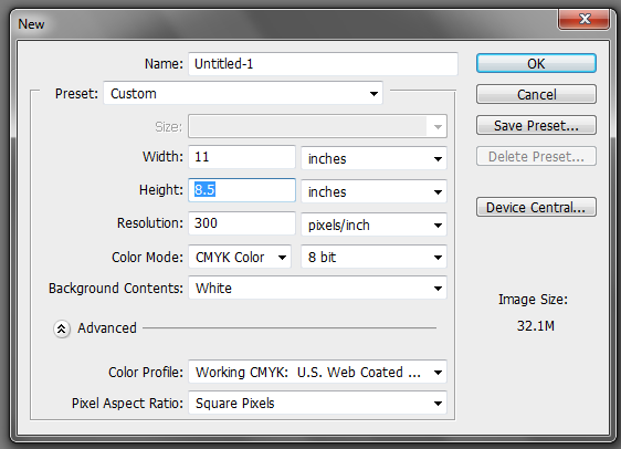
1. The important thing you must remember when setting up a “print ready” design is that you must setup the document properly early on. You will face a lot of issues with your document if you only adjust your design for printing at the last part of the process. This means that once you create a new document in Photoshop, know that you should already be specific with your settings. For a typical “letter-sized” TRIFOLD brochure, the basic settings that you should try out are listed below. Just modify the dimensions here as you see fit.
a. Dimensions (WxH): 11x8.5 inches (a landscape oriented letter sized document)
b. Resolution: 300ppi (minimum recommended for printing)
c. Color Mode: CMYK (for four color printers)
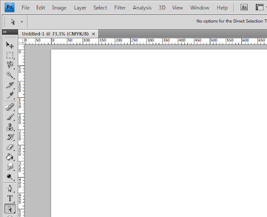
2. Once we have setup the main document, we are now going to add the guidelines. Guidelines are important in making your design print ready as it will help you place your design elements correctly within the bounds for printing. To start creating guidelines you must first have the rulers visible in your Photoshop. If you do not see rulers in your document, press CTRL+R or go to View -> Rulers. You should see the rulers appear at the edges of your document.
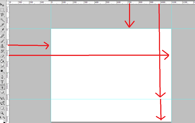
3. Great! Now we are going to define the edges of our document by using the guidelines. Simply click and drag your mouse from the horizontal or vertical ruler to the document. Place the light blue guideline at the precise edge of the canvass. (do not worry about it being at the edge, you will see them clearly enough layer once we increase the size of our document. For now, make sure they are in the correct place.
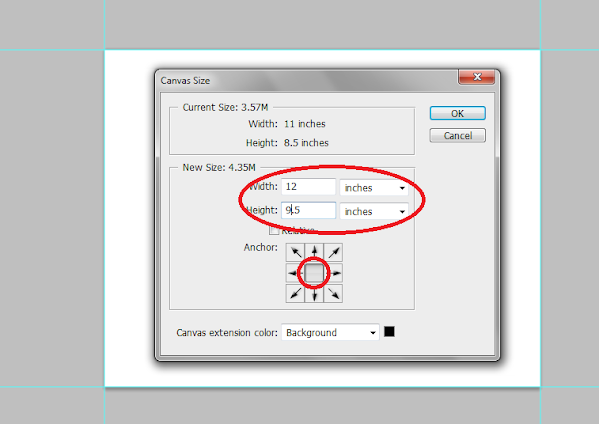
4. Now, we shall make our canvass size bigger. Go to Image -> Canvass Size… Add 1 inch to the width and height values. Also make sure that the anchor is set to the center. By doing this we basically create a margin for our document.
5. It should now have some borders like the picture below. Take note that if your background color is not white, and is set to a different color, the new spaces will probably reflect that color. So just fill those areas with white with the paint bucket tool.
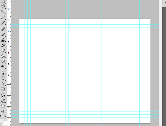
6. Now, we setup the bleeds. Zoom in a bit on a corner of the canvass (hold the ALT key and use the middle scroll mouse button to zoom in easily). Now, create an additional guideline that is 0.25 inches away from our initial margin. This will be the bleed. This margin is the leeway that a designer gives for discrepancies in printing. Do this for all four sides of our document.
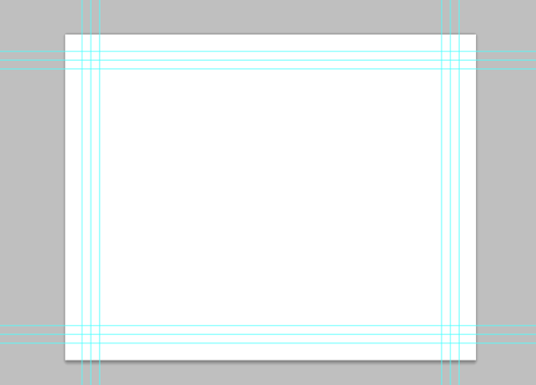
7. Also, in the same fashion, create a security guideline set. These are the guidelines where no text or graphic must cross. This is our main design border so to speak so that no elements get too close to the edges of our design. Just set these guidelines at 0.25 inches away from our bleed border. In the end, you should have something like this:
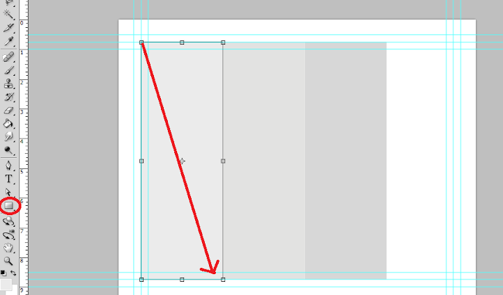
8. Great! Now, before starting with the design. Take note that a Trifold brochure has three major parts or panels. We will create the column guides so that it is easier for you to see where the folds of the trifold brochure will be. To do this easily, create a rectangle shape with a grey color using the Rectangular shape tool. (Do not worry, it can be any size.) Make sure of course that you start from the shape from the corner of our bleed of course to span the whole height of that area. Then, duplicate this shape two times (press CTRL+J). Position the duplicates at the side of the original rectangle. In this example, we have changed the color of the shapes so that they are easily visible.
9. Now, to make the columns equally distributed across the document, we select all three rectangles in the layer panel. Just hold down the shift key and click on all three layers. Afterward, press CTRL+T to enable the transformation of the shapes. Drag the transformation box to the right side bleed border.
10. With those panels in place, you should see where you should put your panel or column guidelines easily. Just add those guidelines like you did with the others. ALSO, add a security border on the left and right side of them as needed. Delete the rectangles once done. In the end we should have a FINAL looking guide document like the picture below. Now would be a good time to save our document as a brochure template.
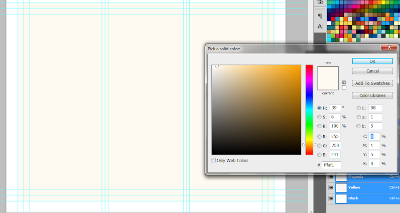
11. Now, before we go forward with our design, we will just setup a base background and some trim guides. Using the rectangle shape tool, we have created a new rectangle with a theme color. Here we are using an off white color (#fffaf1). Make sure it spans our guidelines including the bleed area. This should mark the whole span of the document.
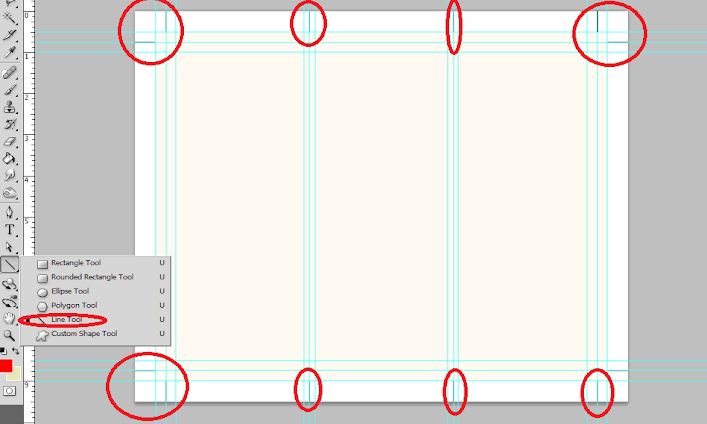
12. Next, using a simple line tool we place in a 1pixel line as trim guides. Use the guide lines for the bleeds to add the trim lines at the outer edge of our design like so. Create a new group and place all these line layers within that group to make things more organized.
13. Great! Now make a final save for this template. You should now be ready to create the real design. Create a new save file (after creating your file template) and name is as your new brochure. Then paste in the background texture or color that you want for your design. Here we are using a grunge texture to establish the theme that we want. We got this for free through this generous person on deviant art. (http://cloaks.deviantart.com/art/Grunge-II-Texture-Pack-91811854).
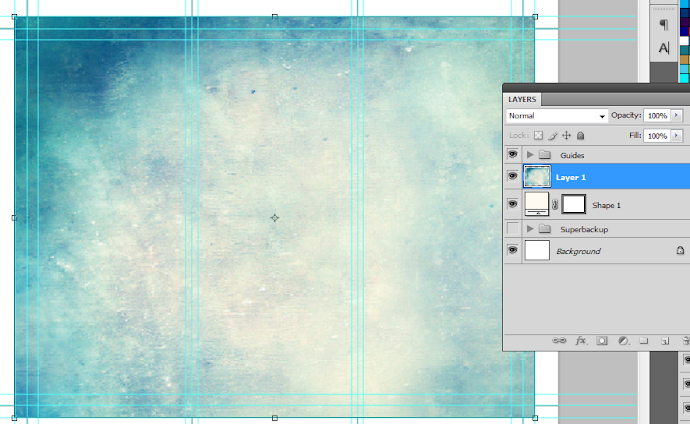
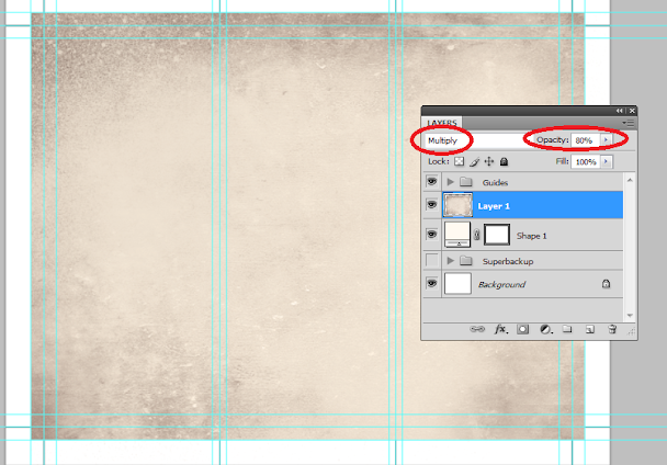
14. Then, press CTRL+SHIFT+U to desaturate our texture layer. Change the blend mode of this texture layer to “Multiply”. This is done through the layers panel. Reduce also its opacity to around 80%.
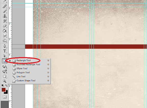
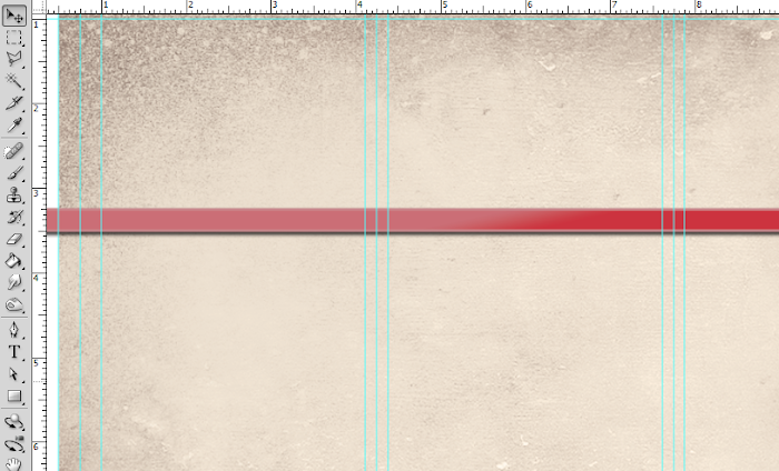
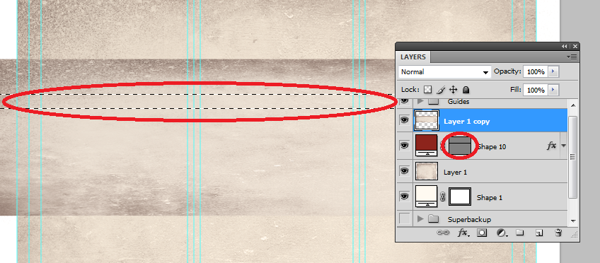
15. Now we shall add additional elements to our design. First we create some ribbons. Using the rectangle shape tool we inscribe a red stripe across our design.
16. Then, double click on the stripe layer. The layer styles and blending options window should open. We will now add some extra effects on our stripe to make it look better. First up is a Gradient Overlay. We click on the Gradient Overlay checkbox and change the color gradient fill by clicking on its box. Make sure to use a good blending of two colors that matches your theme of course in the gradient editor. Also, change the angle of this layer style to 100 degrees.
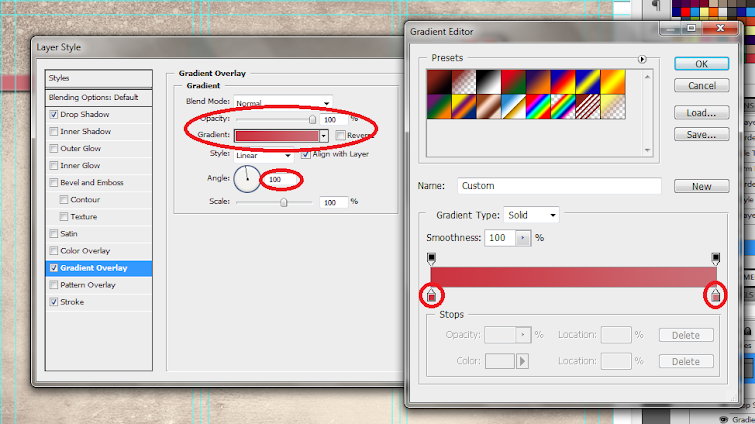
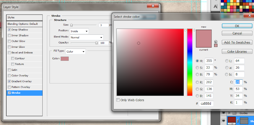
17. Then, click on “Stroke”. Change the following attributes.
a. Size: 3px
b. Position: Inside
c. Color: (use a lighter shade of your gradient).
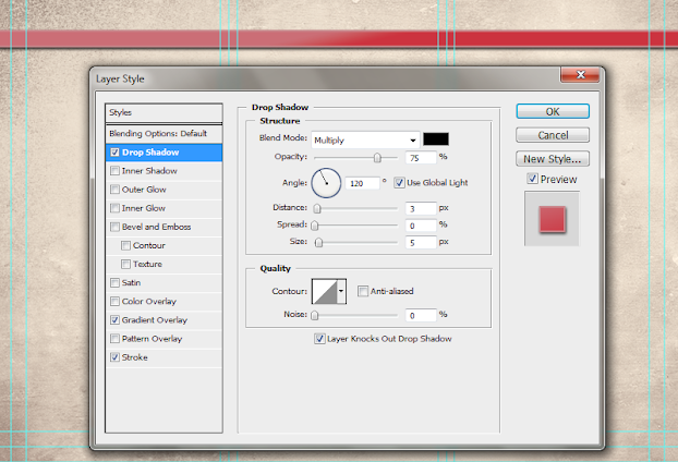
18. Finally, add a drop shadow. Just click on the drop shadow checkbox then change the following values:
a. Drop Shadow color: Black
b. Distance:3px
c. Size: 5px
d. NOTE: you can adjust the values depending on how big or small your stripe is.
19. Once done, you should get something like the picture below. Now, in terms of color this is great, but it is too clean. This means that we will want to add texture.
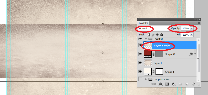
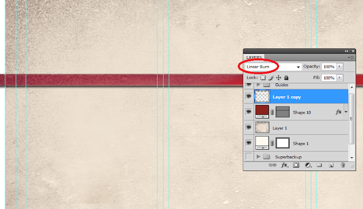
20. To add a texture, we will just use our background texture image. To do this, first duplicate our texture layer by clicking on it in the layers panel and pressing CTRL+J. Then, we move it to the front of our red stripe layer. Change the blend layer back to normal and up the opacity back to 100%. Afterwards, we reduce its size a bit by pressing CTRL+T and then shifting the size to match with the stripe.
21. Now, we will delete the areas of the texture. To do this, hold down the CTRL key and click on the thumbnail of image mask of our stripe (NOT THE TEXTURE). Then press CTRL+SHIFT+I to select the inverse of the stripe layer.
22. Then, click on the texture layer, and then start erasing its edges, leaving only the texture within the stripe area.

23. Finally, change the blend mode of our stripe text layer to “Linear Burn”. This gives us that great texture effect to our stripe. For now, we have removed the guidelines for you to view the textures much clearer. Remember that you can turn on or off the visibility of the guidelines by pressing CTRL+H.
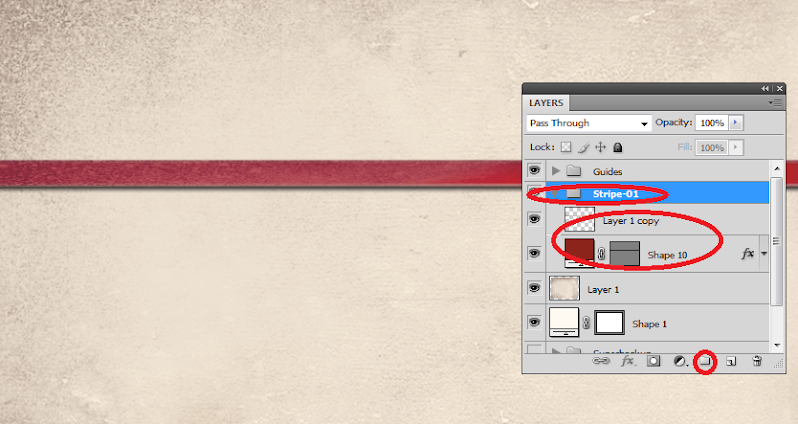
24. Once you are happy with your stripe, create a layer group with this modified texture and the main red stripe. You can do this easily by clicking on the “create a new group” icon in the layers panel.
25. Now, with the group selected, we rotate the stripe so that it is at an angle in a creative fashion. To do this, press CTRL+T to transform our stripe group. Move your mouse over the edge of the box and then just drag your mouse to start rotating the stripe.
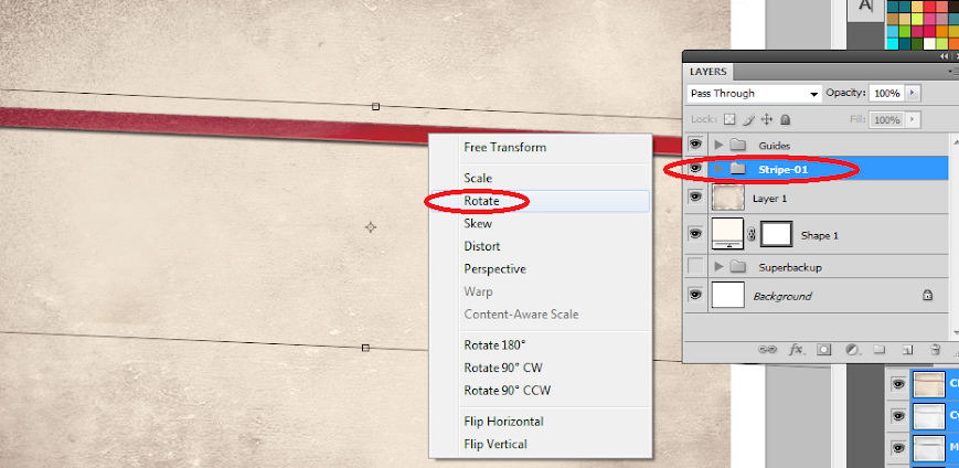
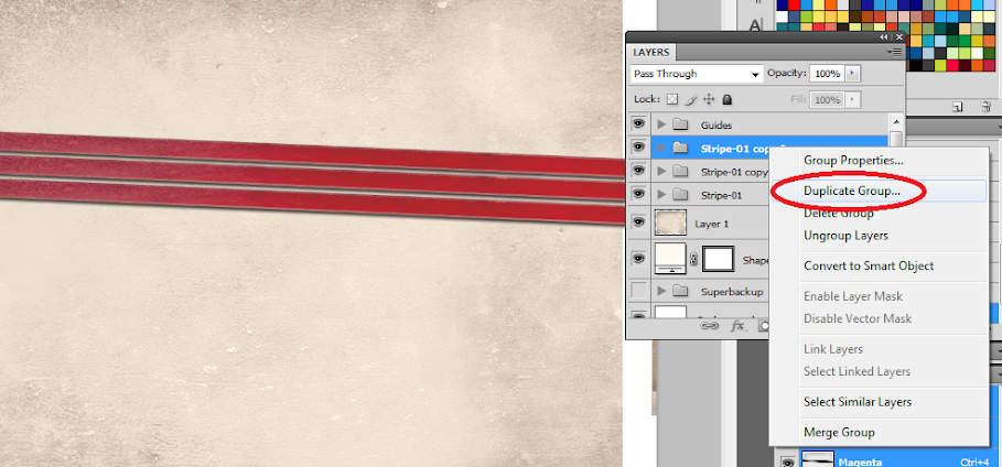
26. Now, right click on the Group layer and select the option “Duplicate Group”. Do this at least two times to create a total of 3 stripes in our design. Transform and rotate these stripes as you see fit for your design.
27. Here is a nice trick. If you want to change the colors of the ribbon, all you have to do is to go into one of the ribbon groups, double click on the actual stripe layer to access its layer styles and then just change the gradient overlay settings with your choice of colors.
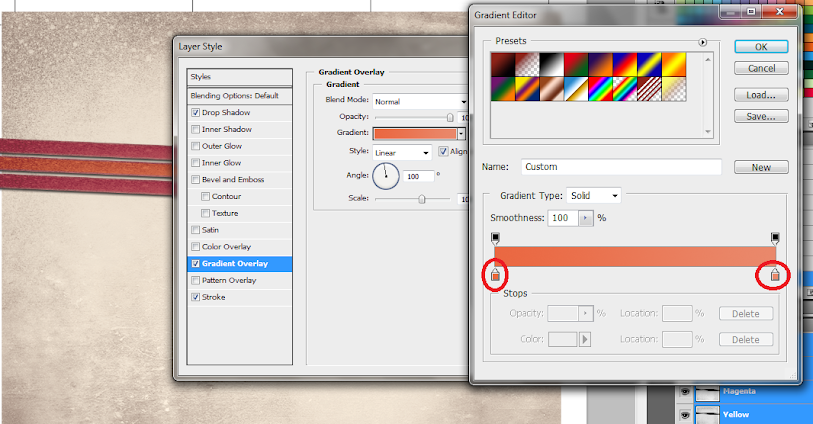
28. For our example we changed the gradient overlay colors for the second and third duplicate stripes to get a nice multi-colored effect for them. Of course, just match the change of colors depending on your color theme.
29. Now, we add the title. Using the text tool we write in our title in a theme color, here we will be using a very dark brown. Just use the font style that fits your theme of course. Also, position the text just above the ribbons or stripes. Take note that the title must be on the right most panel as that is the cover area of brochures in printing. Also remember that you can use the character panel to adjust the line spacing, character spacing and a myriad of other text features and attributes. This should help you edit your title as you see fit correctly.
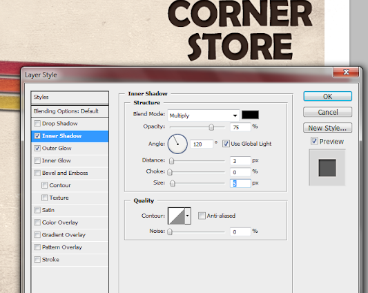
30. Then we go to the layer options for the text. Double click on our text to access those options. First, click on the outer glow option. Change the color of the outer glow to a slightly lighter version of the dark brown color that we used.
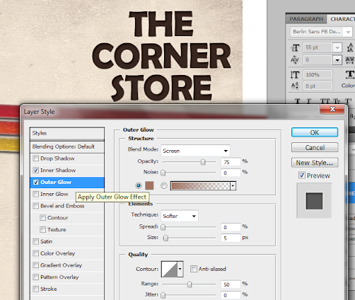
31. Then, click on Inner Shadow. Use a black shadow, with a 3 distance and a 5 pixel size.
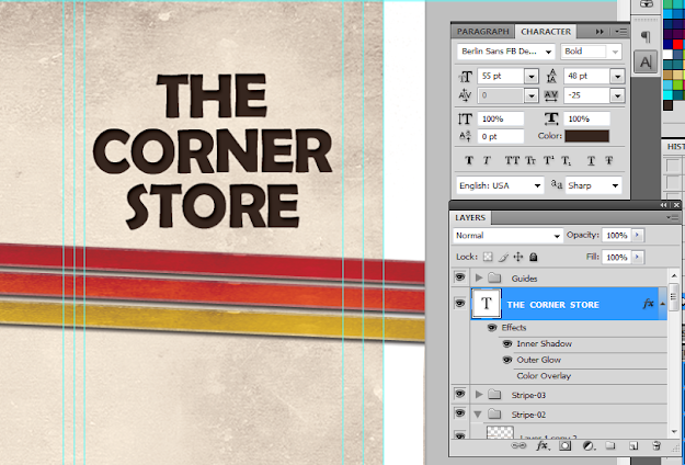
32. Once we apply the layer styles, it should look something like the image below. Take note of the guidelines again. Make sure that your text title is well within the security lines that we placed. Toggle the lines on and off by pressing CTRL+H.
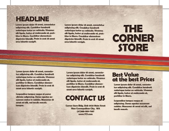
33. Great! Now, just type in the rest of your content. Orient them appropriately on the three panels. Again note that the right most panel is the cover, the middle panel is actually the BACK cover and the left most panel is the inner flap. DO NOT FORGET to always put in the main text paragraphs within the guidelines. We also used the same layer styles in the title for the headlines and sub-headlines.

34. Once we hide the guidelines you should see something like this:
35. Great! Now you have the FIRST SIDE of our brochure. In the next installment of the tutorial we will work on the other side. However, by now, you should know most of the tricks for creating a basic brochure design.
1. The important thing you must remember when setting up a “print ready” design is that you must setup the document properly early on. You will face a lot of issues with your document if you only adjust your design for printing at the last part of the process. This means that once you create a new document in Photoshop, know that you should already be specific with your settings. For a typical “letter-sized” TRIFOLD brochure, the basic settings that you should try out are listed below. Just modify the dimensions here as you see fit.
a. Dimensions (WxH): 11x8.5 inches (a landscape oriented letter sized document)
b. Resolution: 300ppi (minimum recommended for printing)
c. Color Mode: CMYK (for four color printers)
2. Once we have setup the main document, we are now going to add the guidelines. Guidelines are important in making your design print ready as it will help you place your design elements correctly within the bounds for printing. To start creating guidelines you must first have the rulers visible in your Photoshop. If you do not see rulers in your document, press CTRL+R or go to View -> Rulers. You should see the rulers appear at the edges of your document.
3. Great! Now we are going to define the edges of our document by using the guidelines. Simply click and drag your mouse from the horizontal or vertical ruler to the document. Place the light blue guideline at the precise edge of the canvass. (do not worry about it being at the edge, you will see them clearly enough layer once we increase the size of our document. For now, make sure they are in the correct place.
4. Now, we shall make our canvass size bigger. Go to Image -> Canvass Size… Add 1 inch to the width and height values. Also make sure that the anchor is set to the center. By doing this we basically create a margin for our document.
5. It should now have some borders like the picture below. Take note that if your background color is not white, and is set to a different color, the new spaces will probably reflect that color. So just fill those areas with white with the paint bucket tool.
6. Now, we setup the bleeds. Zoom in a bit on a corner of the canvass (hold the ALT key and use the middle scroll mouse button to zoom in easily). Now, create an additional guideline that is 0.25 inches away from our initial margin. This will be the bleed. This margin is the leeway that a designer gives for discrepancies in printing. Do this for all four sides of our document.
7. Also, in the same fashion, create a security guideline set. These are the guidelines where no text or graphic must cross. This is our main design border so to speak so that no elements get too close to the edges of our design. Just set these guidelines at 0.25 inches away from our bleed border. In the end, you should have something like this:
8. Great! Now, before starting with the design. Take note that a Trifold brochure has three major parts or panels. We will create the column guides so that it is easier for you to see where the folds of the trifold brochure will be. To do this easily, create a rectangle shape with a grey color using the Rectangular shape tool. (Do not worry, it can be any size.) Make sure of course that you start from the shape from the corner of our bleed of course to span the whole height of that area. Then, duplicate this shape two times (press CTRL+J). Position the duplicates at the side of the original rectangle. In this example, we have changed the color of the shapes so that they are easily visible.
9. Now, to make the columns equally distributed across the document, we select all three rectangles in the layer panel. Just hold down the shift key and click on all three layers. Afterward, press CTRL+T to enable the transformation of the shapes. Drag the transformation box to the right side bleed border.
10. With those panels in place, you should see where you should put your panel or column guidelines easily. Just add those guidelines like you did with the others. ALSO, add a security border on the left and right side of them as needed. Delete the rectangles once done. In the end we should have a FINAL looking guide document like the picture below. Now would be a good time to save our document as a brochure template.
11. Now, before we go forward with our design, we will just setup a base background and some trim guides. Using the rectangle shape tool, we have created a new rectangle with a theme color. Here we are using an off white color (#fffaf1). Make sure it spans our guidelines including the bleed area. This should mark the whole span of the document.
12. Next, using a simple line tool we place in a 1pixel line as trim guides. Use the guide lines for the bleeds to add the trim lines at the outer edge of our design like so. Create a new group and place all these line layers within that group to make things more organized.
13. Great! Now make a final save for this template. You should now be ready to create the real design. Create a new save file (after creating your file template) and name is as your new brochure. Then paste in the background texture or color that you want for your design. Here we are using a grunge texture to establish the theme that we want. We got this for free through this generous person on deviant art. (http://cloaks.deviantart.com/art/Grunge-II-Texture-Pack-91811854).
14. Then, press CTRL+SHIFT+U to desaturate our texture layer. Change the blend mode of this texture layer to “Multiply”. This is done through the layers panel. Reduce also its opacity to around 80%.
15. Now we shall add additional elements to our design. First we create some ribbons. Using the rectangle shape tool we inscribe a red stripe across our design.
16. Then, double click on the stripe layer. The layer styles and blending options window should open. We will now add some extra effects on our stripe to make it look better. First up is a Gradient Overlay. We click on the Gradient Overlay checkbox and change the color gradient fill by clicking on its box. Make sure to use a good blending of two colors that matches your theme of course in the gradient editor. Also, change the angle of this layer style to 100 degrees.
17. Then, click on “Stroke”. Change the following attributes.
a. Size: 3px
b. Position: Inside
c. Color: (use a lighter shade of your gradient).
18. Finally, add a drop shadow. Just click on the drop shadow checkbox then change the following values:
a. Drop Shadow color: Black
b. Distance:3px
c. Size: 5px
d. NOTE: you can adjust the values depending on how big or small your stripe is.
19. Once done, you should get something like the picture below. Now, in terms of color this is great, but it is too clean. This means that we will want to add texture.
20. To add a texture, we will just use our background texture image. To do this, first duplicate our texture layer by clicking on it in the layers panel and pressing CTRL+J. Then, we move it to the front of our red stripe layer. Change the blend layer back to normal and up the opacity back to 100%. Afterwards, we reduce its size a bit by pressing CTRL+T and then shifting the size to match with the stripe.
21. Now, we will delete the areas of the texture. To do this, hold down the CTRL key and click on the thumbnail of image mask of our stripe (NOT THE TEXTURE). Then press CTRL+SHIFT+I to select the inverse of the stripe layer.
22. Then, click on the texture layer, and then start erasing its edges, leaving only the texture within the stripe area.
23. Finally, change the blend mode of our stripe text layer to “Linear Burn”. This gives us that great texture effect to our stripe. For now, we have removed the guidelines for you to view the textures much clearer. Remember that you can turn on or off the visibility of the guidelines by pressing CTRL+H.
24. Once you are happy with your stripe, create a layer group with this modified texture and the main red stripe. You can do this easily by clicking on the “create a new group” icon in the layers panel.
25. Now, with the group selected, we rotate the stripe so that it is at an angle in a creative fashion. To do this, press CTRL+T to transform our stripe group. Move your mouse over the edge of the box and then just drag your mouse to start rotating the stripe.
26. Now, right click on the Group layer and select the option “Duplicate Group”. Do this at least two times to create a total of 3 stripes in our design. Transform and rotate these stripes as you see fit for your design.
27. Here is a nice trick. If you want to change the colors of the ribbon, all you have to do is to go into one of the ribbon groups, double click on the actual stripe layer to access its layer styles and then just change the gradient overlay settings with your choice of colors.
28. For our example we changed the gradient overlay colors for the second and third duplicate stripes to get a nice multi-colored effect for them. Of course, just match the change of colors depending on your color theme.
29. Now, we add the title. Using the text tool we write in our title in a theme color, here we will be using a very dark brown. Just use the font style that fits your theme of course. Also, position the text just above the ribbons or stripes. Take note that the title must be on the right most panel as that is the cover area of brochures in printing. Also remember that you can use the character panel to adjust the line spacing, character spacing and a myriad of other text features and attributes. This should help you edit your title as you see fit correctly.
30. Then we go to the layer options for the text. Double click on our text to access those options. First, click on the outer glow option. Change the color of the outer glow to a slightly lighter version of the dark brown color that we used.
31. Then, click on Inner Shadow. Use a black shadow, with a 3 distance and a 5 pixel size.
32. Once we apply the layer styles, it should look something like the image below. Take note of the guidelines again. Make sure that your text title is well within the security lines that we placed. Toggle the lines on and off by pressing CTRL+H.
33. Great! Now, just type in the rest of your content. Orient them appropriately on the three panels. Again note that the right most panel is the cover, the middle panel is actually the BACK cover and the left most panel is the inner flap. DO NOT FORGET to always put in the main text paragraphs within the guidelines. We also used the same layer styles in the title for the headlines and sub-headlines.
34. Once we hide the guidelines you should see something like this:
35. Great! Now you have the FIRST SIDE of our brochure. In the next installment of the tutorial we will work on the other side. However, by now, you should know most of the tricks for creating a basic brochure design.
... link (0 Kommentare) ... comment
Photoshop Guide: City Fashion Design
ilovegraphics, 18:20h
In this guide, I will teach you how to create your own “City Fashion” design. So just follow the step-by-step instructions below to get started.
1. To start, we will first setup the document. For the sake of this tutorial, let’s design a poster. You can however, apply such a design on brochures, postcards and booklet or magazine covers as well. Once you open Adobe Photoshop, press CTRL+N to create a new document. In the window that opens, set the proper poster dimensions that you want for your poster file. You will also need to set a resolution of at least 300ppi if this is for high quality printing.

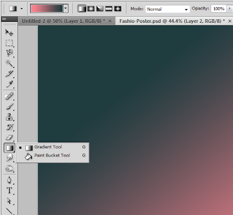
2. Now that the new document is open, we paint out background black using the paint bucket tool as the base. Then, create a new layer by pressing CTRL+SHIFT+N. Name this Gradient. Using the gradient tool (Shortcut G), place a color gradient with two of your theme colors diagonally unto the canvass like so. Set the opacity of this layer to 65%.
3. Now, create another layer. Name this one clouds. Make sure that you are back to your default colors by pressing (D). Then go to Filter -> Render -> Clouds. Once the clouds are rendered, set its blend mode to multiply.

4. Now, we create a new group in the layers panel by clicking on the “new group” icon below the panel. Then, we drag both our gradient and color layers into it. For the group itself, we change its blend mode to Normal and change its Opacity to 65%. Afterwards, we right click on the group and select merge group. By doing so we preserve the opacity values of the layers to get the cloud group that we want.

5. Duplicate our merged layer by pressing CTRL+J. With the duplicate selected, go to Filter -> Blur -> Motion Blur. In the window that opens, set the Angle to 90 degrees and the distance to 600 pixels.

6. We then change this duplicate’s blend mode to “Soft Light”.

7. Then we paste in the image of a city at night. Scale the city image by selecting it and Pressing CTRL+T (Transform). You can right click on the transform box to get the different transform options, however just scaling option is the most important mode that you will want. Hold down the shift key as you reduce or increase the size so that the proportions are preserved. Using the eraser or the magnetic lasso tool, erase the sky as needed.

8. Now, double click on our city layer to access the layer styles window. Click on the option for “Gradient Overlay”. Change the settings as follows.
a. Blend Mode: Hue
b. Gradient Color: The same gradient color you used originally for the background
c. Angle: 90 Degrees

9. Once done, we should have something like this now:

10. Now, you will need to duplicate the city later two times. You can do this easily by pressing CTRL+J twice. Merge these layers so that the gradient overlay gets integrated into one layer. Then duplicate that layer again once. The result should give you 3 main layers. We have named them here City Top, City Bottom and Main (the one with the gradient overlay still active).

11. Now, double click on “City Top”. Go to the layer styles window and click on “Gradient Overlay”. Change the settings to these values.
a. Blend mode: Overlay
b. Gradient: Pink to Orange
c. Angle: 120 degrees

12. Next, enter the quick mask mode by pressing “Q”. Then using a fuzzy brush, paint up the areas that you want to be highlighted and motion blurred in the cityscape. The best spots here are the top parts of the buildings, most especially the ones with brighter lights. The selection area should turn red. Do not worry about this.

13. Press “Q” again or click the quick mask icon to see the outside area of the brush you painted turn to a selection. Press CTRL+SHIFT+I to invert the selection and select what we want. With the area selection ready, just click on City Bottom to select it.

14. Then Press CTRL+C and CTRL+V to copy and paste the selection from city bottom. With this new layer selected, go to Filters -> Blur -> Motion Blur… Use a 90 degree angle and as for the distance, use a value that is appropriate for your design. The higher the value the higher those light streaks reach. Here we used 800 pixels.

15. Now, duplicate this layer 4-6 times depending on how thick you want the streaks to be. Merge those duplicates into one again and bring them to the top layer.

16. Double click on this streaks layer. Add a pink and white color gradient. Here are the settings:
a. Blend Mode: Overlay
b. Color: Pink to White
c. Angle: 90 degrees

17. Once you press ok, change the blend mode of the actual layer to Lighten and reduce its opacity to 75%. If you think some parts of the city have too much streaks, simple create a layer mask on the streaks layer and then use a soft black brush to remove small parts of the streaks.

18. As the final touch for our background, create a new layer on top of everything. Then use a soft black brush and paint the bottom area black, blending seamlessly with the bottom part of our city.

19. Great! Now, it is time to insert our model. Paste in our model picture just behind the black layer that we just made. For this example we have already processed this model image by removing its background. We used a mixture of the Magnetic Lasso tool and the Magic wand tool to get the model’s background out, just like what we did with the original sky of the city.

20. Then, we will adjust the lighting of the model image. Go to Image -> Adjustments -> Curves. In the graph that opens, adjust the curves so that it looks almost like the curve below. It does not have to be exact. The point here is to make the darker values in the image more intense and emphasize the lighter ones. Also, this removes and noisier elements that the original image had.

21. Next, we will use some free glass shards images from this site: http://www.officialpsds.com/Shattered-Glass-2-PSD56151.html This will add a more grungy shattered effect to our mode. We just paste in the glass shards in the free resource just behind our model layer. We de-saturated it by pressing CTRL+SHIFT+U and then rotated it by pressing CTRL+T for transform.

22. Now, duplicate this shattered layer and hide the original for now. Using the duplicate, transform it to a smaller size that fits our model. Then hold down the CTRL key and click on its thumbnail to select its image areas.

23. Next, this is the important part. With this area selected, click on the Model layer. Then press CTRL+J to duplicate the model layer, but with only the selected shard areas. Once the duplicate is done, shift the location of this shard-model layer on top of the main model. Then use the arrow keys 1-4 pixels to the left and 1-4 pixels to the right. This gives you a model slightly being broken to pieces.

24. Now, remember the duplicate layer we left earlier of the glass shards? Just make it visible again, then duplicate it 2-3 more times and move it across the background. Merge all of those layers. Then, use a hard eraser tool to erase some of the glass, shaping it so that some parts of the shards becomes our mode’s wings.

25. Now, duplicate this shard wing layer. On the duplicate, add more gradient colors from your color theme. Change the blend mode to Multiply.

26. Then, bring the original shard layer in front and then with a soft and large eraser, erase the area just at the edges of the shards to bring in the color underneath.

27. Finally, using the text tool we just add in the poster title. Here we used some creative font styles for an easy stylized effect.

28. Great! Now you are done with our city fashion poster.

1. To start, we will first setup the document. For the sake of this tutorial, let’s design a poster. You can however, apply such a design on brochures, postcards and booklet or magazine covers as well. Once you open Adobe Photoshop, press CTRL+N to create a new document. In the window that opens, set the proper poster dimensions that you want for your poster file. You will also need to set a resolution of at least 300ppi if this is for high quality printing.
2. Now that the new document is open, we paint out background black using the paint bucket tool as the base. Then, create a new layer by pressing CTRL+SHIFT+N. Name this Gradient. Using the gradient tool (Shortcut G), place a color gradient with two of your theme colors diagonally unto the canvass like so. Set the opacity of this layer to 65%.
3. Now, create another layer. Name this one clouds. Make sure that you are back to your default colors by pressing (D). Then go to Filter -> Render -> Clouds. Once the clouds are rendered, set its blend mode to multiply.
4. Now, we create a new group in the layers panel by clicking on the “new group” icon below the panel. Then, we drag both our gradient and color layers into it. For the group itself, we change its blend mode to Normal and change its Opacity to 65%. Afterwards, we right click on the group and select merge group. By doing so we preserve the opacity values of the layers to get the cloud group that we want.
5. Duplicate our merged layer by pressing CTRL+J. With the duplicate selected, go to Filter -> Blur -> Motion Blur. In the window that opens, set the Angle to 90 degrees and the distance to 600 pixels.
6. We then change this duplicate’s blend mode to “Soft Light”.
7. Then we paste in the image of a city at night. Scale the city image by selecting it and Pressing CTRL+T (Transform). You can right click on the transform box to get the different transform options, however just scaling option is the most important mode that you will want. Hold down the shift key as you reduce or increase the size so that the proportions are preserved. Using the eraser or the magnetic lasso tool, erase the sky as needed.
8. Now, double click on our city layer to access the layer styles window. Click on the option for “Gradient Overlay”. Change the settings as follows.
a. Blend Mode: Hue
b. Gradient Color: The same gradient color you used originally for the background
c. Angle: 90 Degrees
9. Once done, we should have something like this now:
10. Now, you will need to duplicate the city later two times. You can do this easily by pressing CTRL+J twice. Merge these layers so that the gradient overlay gets integrated into one layer. Then duplicate that layer again once. The result should give you 3 main layers. We have named them here City Top, City Bottom and Main (the one with the gradient overlay still active).
11. Now, double click on “City Top”. Go to the layer styles window and click on “Gradient Overlay”. Change the settings to these values.
a. Blend mode: Overlay
b. Gradient: Pink to Orange
c. Angle: 120 degrees
12. Next, enter the quick mask mode by pressing “Q”. Then using a fuzzy brush, paint up the areas that you want to be highlighted and motion blurred in the cityscape. The best spots here are the top parts of the buildings, most especially the ones with brighter lights. The selection area should turn red. Do not worry about this.
13. Press “Q” again or click the quick mask icon to see the outside area of the brush you painted turn to a selection. Press CTRL+SHIFT+I to invert the selection and select what we want. With the area selection ready, just click on City Bottom to select it.
14. Then Press CTRL+C and CTRL+V to copy and paste the selection from city bottom. With this new layer selected, go to Filters -> Blur -> Motion Blur… Use a 90 degree angle and as for the distance, use a value that is appropriate for your design. The higher the value the higher those light streaks reach. Here we used 800 pixels.
15. Now, duplicate this layer 4-6 times depending on how thick you want the streaks to be. Merge those duplicates into one again and bring them to the top layer.
16. Double click on this streaks layer. Add a pink and white color gradient. Here are the settings:
a. Blend Mode: Overlay
b. Color: Pink to White
c. Angle: 90 degrees
17. Once you press ok, change the blend mode of the actual layer to Lighten and reduce its opacity to 75%. If you think some parts of the city have too much streaks, simple create a layer mask on the streaks layer and then use a soft black brush to remove small parts of the streaks.
18. As the final touch for our background, create a new layer on top of everything. Then use a soft black brush and paint the bottom area black, blending seamlessly with the bottom part of our city.
19. Great! Now, it is time to insert our model. Paste in our model picture just behind the black layer that we just made. For this example we have already processed this model image by removing its background. We used a mixture of the Magnetic Lasso tool and the Magic wand tool to get the model’s background out, just like what we did with the original sky of the city.
20. Then, we will adjust the lighting of the model image. Go to Image -> Adjustments -> Curves. In the graph that opens, adjust the curves so that it looks almost like the curve below. It does not have to be exact. The point here is to make the darker values in the image more intense and emphasize the lighter ones. Also, this removes and noisier elements that the original image had.
21. Next, we will use some free glass shards images from this site: http://www.officialpsds.com/Shattered-Glass-2-PSD56151.html This will add a more grungy shattered effect to our mode. We just paste in the glass shards in the free resource just behind our model layer. We de-saturated it by pressing CTRL+SHIFT+U and then rotated it by pressing CTRL+T for transform.
22. Now, duplicate this shattered layer and hide the original for now. Using the duplicate, transform it to a smaller size that fits our model. Then hold down the CTRL key and click on its thumbnail to select its image areas.
23. Next, this is the important part. With this area selected, click on the Model layer. Then press CTRL+J to duplicate the model layer, but with only the selected shard areas. Once the duplicate is done, shift the location of this shard-model layer on top of the main model. Then use the arrow keys 1-4 pixels to the left and 1-4 pixels to the right. This gives you a model slightly being broken to pieces.
24. Now, remember the duplicate layer we left earlier of the glass shards? Just make it visible again, then duplicate it 2-3 more times and move it across the background. Merge all of those layers. Then, use a hard eraser tool to erase some of the glass, shaping it so that some parts of the shards becomes our mode’s wings.
25. Now, duplicate this shard wing layer. On the duplicate, add more gradient colors from your color theme. Change the blend mode to Multiply.
26. Then, bring the original shard layer in front and then with a soft and large eraser, erase the area just at the edges of the shards to bring in the color underneath.
27. Finally, using the text tool we just add in the poster title. Here we used some creative font styles for an easy stylized effect.
28. Great! Now you are done with our city fashion poster.
... link (0 Kommentare) ... comment
Designing a Psychological Thriller Themed Design in Photoshop
ilovegraphics, 18:09h
Creating a Psychological Thriller movie poster will require some special effects to fully emphasize the thrilling and psychological nature of your design’s subject or theme. Here in this tutorial, you will learn some easy techniques on how to accomplish these effects. Let us get started.
1.The first thing that we need to do is to process our main image model. So we open the image and then start with taking out the background. By the way, this image came free from a very generous photographer located here: (http://b-e-c-k-y-stock.deviantart.com/). Now there are many ways to do this using Adobe Photoshop, and it all depends on how well prepared the image is. In our example, it was pretty easy using the magic wand tool to select and take out the background. However, you can also use the magnetic lasso tool as well as the pen tool if you want to inscribe the selection yourself.

2.Now, with that main image prepared, we will now create our main poster document. For this tutorials sake we are designing a poster but bear in mind that you can also apply this effect on brochures, the flyers, even postcards. Just press CTRL+N in Adobe Photoshop to create a new document. Set the dimensions as needed for your poster design. Set the resolution to 300ppi if the document is truly for printing. Set it lower if it is just for web (around 72). Once done, press OK.

3.With the new document open, we paste in our background (a city street) and our main model image that has been processed earlier. We have scaled both images of course to match each other relatively fine. To do this simply press CTRL+T with a layer selected and then adjust the size using the transformation box. Scale them properly by holding down the shift key as you resize the box so that the proportions are constrained.

4.Now, we will add a color layer to add to our design so that we integrate both our background and our main image better. Create a new layer on top of everything. Now, Using the Gradient tool create a radial color gradient in the new empty layer. Make sure of course that you are using your theme color. Change the color of your background and foreground to achieve this.

5.Now, look at the layer in the layers panel. Change the blend mode to “Color” and reduce the opacity to 90%. This should give our layer the selected color theme that we like.

6.Good. Now duplicate the background layer with buildings that we have. Do this by simply clicking on that layer in the layers panel and pressing CTRL+J. Hide that original for now as backup, buy clicking on its visibility icon (eye icon). Once done, click on the duplicate buildings/background layer.Press CTRL+T to start transforming this background. Right click on the grid that appears and select “Warp”. Then, just use your mouse to twist and turn the image to your specifications. Here we are communicating the sense of confusion and psychological dysfunction.

7.We shall darken our background a bit more. With the background layer selected, go to Image -> Adjustments -> Levels.Adjust the shadow input level (leftmost arrow) a little bit to the right to darken our image a bit.

8.Now, click on this new warped layer to select it. Use the magic wand tool to select the sky and horizon from our background image. Create a new layer by pressing CTRL+N and then fill that selected area with a theme color whilst the new layer is active. This gives us the opportunity to make some special effect on the Horizon.

9.Great. Now with the “horizon” or sky layer selected go to Filter -> Blur -> Gaussian Blur. In the window that opens, select a radius of 28 pixels.

10.Then, change the blend mode of this layer to “Soft light”. Duplicate this layer 4-5 more times after by pressing CTRL+J. this should make it look brighter.

11.Then, duplicate our background buildings layer by pressing CTRL+J. Change the opacity of the duplicate to 75%. Then nudge it 5-10 times to the right. This gives us a double vision effect that should enhance the intense emotion of our poster.

12.Good! Now to organize things. We created two groups, the highlights layer group and the backgrounds layer group so that it is easy to see the other layers that we will be creating. The next step is to work on our main model. First up create a new layer behind the guy by pressing CTRL+SHIFT+N. Then, using a very soft and small black brush we paint in soft shadows below the feet of our model. Then we reduce the opacity of this layer by 60%.

13.Now we shall create a longer shadow. Create a new layer again. Next, hold down the CTRL key and click on the thumbnail of our guy model layer. This will select the area of that layer. Use the paint bucket tool to paint this in black.

14.Now, put press CTRL+T to transform this layer. Rotate it so that it looks like a long shadow emanating from our guy.

15.Afterwards, apply a Gaussian blur to this long shadow. Go to Filters -> Blur -> Gaussian Blur.Use a 5 pixel radius.

16.Next up, we reduce the opacity of this layer to 90%. Then using a large and soft ERASER brush, we erase some parts of the bottom part of the poster so that they fade out.

17.Now we start with highlighting the guy. Using a soft dodge tool, we highlight parts of the skin of our main model. Make sure to adjust the size of the brush accordingly so that it fits okay.

18.Now, we will add some highlights on the body. We create another new layer on top of the scared guy layer by pressing CTRL+SHIFT+N. We then select the area of that scared guy layer by holding down the CTRL key and clicking on its thumbnail. We then click on the new layer again (light guy) and then paint up our highlights with a soft, small white brush.

19.Then we add some subtle color. Duplicate our main guy layer again and move it on top of all the layers. We change its blend mode to color. Afterwards, we erase parts of its edges so that only parts of the skin have color while the rest retain the cool eerie color.

20.Then, we type in our text title for our poster. Just us some creative fonts when you can.

21.Great! Now as a finishing touch, we will add some filters. First, merge all the layers that you have into one. Duplicate the merged layer once. Then with that selected go to Filters -> Artistic-> Film Grain. Adjust the values of the grain as you want. Look at the previews in the window.

22.Then, just change the blend mode of this filtered layer to Overlay and reduce the opacity to 70%.

23.Great! Now we have finished our Psychological Thriller poster. Congratulations!

1.The first thing that we need to do is to process our main image model. So we open the image and then start with taking out the background. By the way, this image came free from a very generous photographer located here: (http://b-e-c-k-y-stock.deviantart.com/). Now there are many ways to do this using Adobe Photoshop, and it all depends on how well prepared the image is. In our example, it was pretty easy using the magic wand tool to select and take out the background. However, you can also use the magnetic lasso tool as well as the pen tool if you want to inscribe the selection yourself.
2.Now, with that main image prepared, we will now create our main poster document. For this tutorials sake we are designing a poster but bear in mind that you can also apply this effect on brochures, the flyers, even postcards. Just press CTRL+N in Adobe Photoshop to create a new document. Set the dimensions as needed for your poster design. Set the resolution to 300ppi if the document is truly for printing. Set it lower if it is just for web (around 72). Once done, press OK.
3.With the new document open, we paste in our background (a city street) and our main model image that has been processed earlier. We have scaled both images of course to match each other relatively fine. To do this simply press CTRL+T with a layer selected and then adjust the size using the transformation box. Scale them properly by holding down the shift key as you resize the box so that the proportions are constrained.
4.Now, we will add a color layer to add to our design so that we integrate both our background and our main image better. Create a new layer on top of everything. Now, Using the Gradient tool create a radial color gradient in the new empty layer. Make sure of course that you are using your theme color. Change the color of your background and foreground to achieve this.
5.Now, look at the layer in the layers panel. Change the blend mode to “Color” and reduce the opacity to 90%. This should give our layer the selected color theme that we like.
6.Good. Now duplicate the background layer with buildings that we have. Do this by simply clicking on that layer in the layers panel and pressing CTRL+J. Hide that original for now as backup, buy clicking on its visibility icon (eye icon). Once done, click on the duplicate buildings/background layer.Press CTRL+T to start transforming this background. Right click on the grid that appears and select “Warp”. Then, just use your mouse to twist and turn the image to your specifications. Here we are communicating the sense of confusion and psychological dysfunction.
7.We shall darken our background a bit more. With the background layer selected, go to Image -> Adjustments -> Levels.Adjust the shadow input level (leftmost arrow) a little bit to the right to darken our image a bit.
8.Now, click on this new warped layer to select it. Use the magic wand tool to select the sky and horizon from our background image. Create a new layer by pressing CTRL+N and then fill that selected area with a theme color whilst the new layer is active. This gives us the opportunity to make some special effect on the Horizon.
9.Great. Now with the “horizon” or sky layer selected go to Filter -> Blur -> Gaussian Blur. In the window that opens, select a radius of 28 pixels.
10.Then, change the blend mode of this layer to “Soft light”. Duplicate this layer 4-5 more times after by pressing CTRL+J. this should make it look brighter.
11.Then, duplicate our background buildings layer by pressing CTRL+J. Change the opacity of the duplicate to 75%. Then nudge it 5-10 times to the right. This gives us a double vision effect that should enhance the intense emotion of our poster.
12.Good! Now to organize things. We created two groups, the highlights layer group and the backgrounds layer group so that it is easy to see the other layers that we will be creating. The next step is to work on our main model. First up create a new layer behind the guy by pressing CTRL+SHIFT+N. Then, using a very soft and small black brush we paint in soft shadows below the feet of our model. Then we reduce the opacity of this layer by 60%.
13.Now we shall create a longer shadow. Create a new layer again. Next, hold down the CTRL key and click on the thumbnail of our guy model layer. This will select the area of that layer. Use the paint bucket tool to paint this in black.
14.Now, put press CTRL+T to transform this layer. Rotate it so that it looks like a long shadow emanating from our guy.
15.Afterwards, apply a Gaussian blur to this long shadow. Go to Filters -> Blur -> Gaussian Blur.Use a 5 pixel radius.
16.Next up, we reduce the opacity of this layer to 90%. Then using a large and soft ERASER brush, we erase some parts of the bottom part of the poster so that they fade out.
17.Now we start with highlighting the guy. Using a soft dodge tool, we highlight parts of the skin of our main model. Make sure to adjust the size of the brush accordingly so that it fits okay.
18.Now, we will add some highlights on the body. We create another new layer on top of the scared guy layer by pressing CTRL+SHIFT+N. We then select the area of that scared guy layer by holding down the CTRL key and clicking on its thumbnail. We then click on the new layer again (light guy) and then paint up our highlights with a soft, small white brush.
19.Then we add some subtle color. Duplicate our main guy layer again and move it on top of all the layers. We change its blend mode to color. Afterwards, we erase parts of its edges so that only parts of the skin have color while the rest retain the cool eerie color.
20.Then, we type in our text title for our poster. Just us some creative fonts when you can.
21.Great! Now as a finishing touch, we will add some filters. First, merge all the layers that you have into one. Duplicate the merged layer once. Then with that selected go to Filters -> Artistic-> Film Grain. Adjust the values of the grain as you want. Look at the previews in the window.
22.Then, just change the blend mode of this filtered layer to Overlay and reduce the opacity to 70%.
23.Great! Now we have finished our Psychological Thriller poster. Congratulations!
... link (0 Kommentare) ... comment